Bangalore Design Festival
Hypothetical design conference held in Bangalore, India. The conference is a platform which seeks to empower the aspiring people in collaborating them with the greatest leaders in creative & tech community.
Project Type
Branding & Marketing
Domain
Event


Overview

What was the concept?
A hypothetical brand identity for a design festival celebrating Bangalore's creative community — conference by the creatives, for the creatives.
Who is the audience?
Designers, creative professionals, and design enthusiasts across India's Silicon Valley — Bangalore.
What was the design challenge?
Create a cohesive visual identity that captures the energy of a city-wide design festival — from logo to physical touchpoints.
What did I explore?
Logo design, typography system, speaker posters, event tickets, ID cards, hand bands, tote bags, notebooks, and signage graphics.
A design conference like no other.
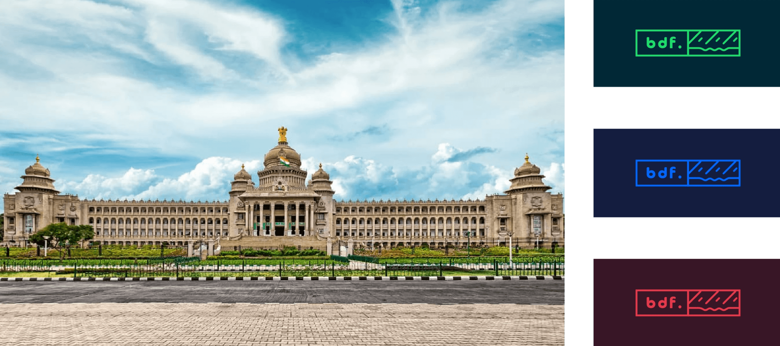
Bangalore is renowned for being the Silicon Valley of India. As the capital city of Karnataka, it is a well-known IT hub, home to several major IT corporations. However, the city is not just known for its technology sector. It boasts a rich history, and the unique combination of technology and youthful lifestyle sets it apart from other cities.
Design
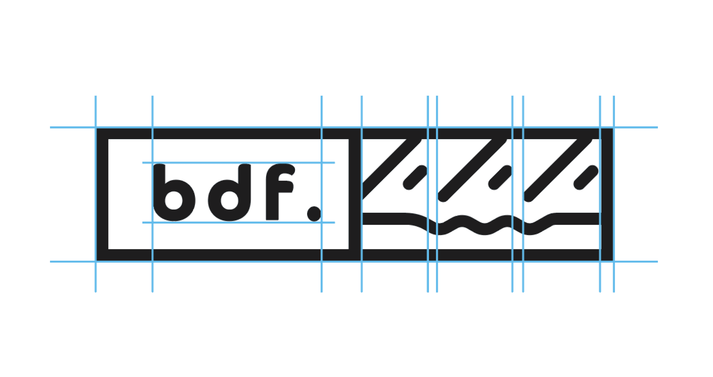
Logo Concept Description
The concept behind the logo is to highlight the city's characteristic of being welcoming to talented individuals.
The lines on the right side of the logo represent the ups and downs that people face in their careers.
The city may present both challenges and rewards, but with self-belief, one can achieve stability.
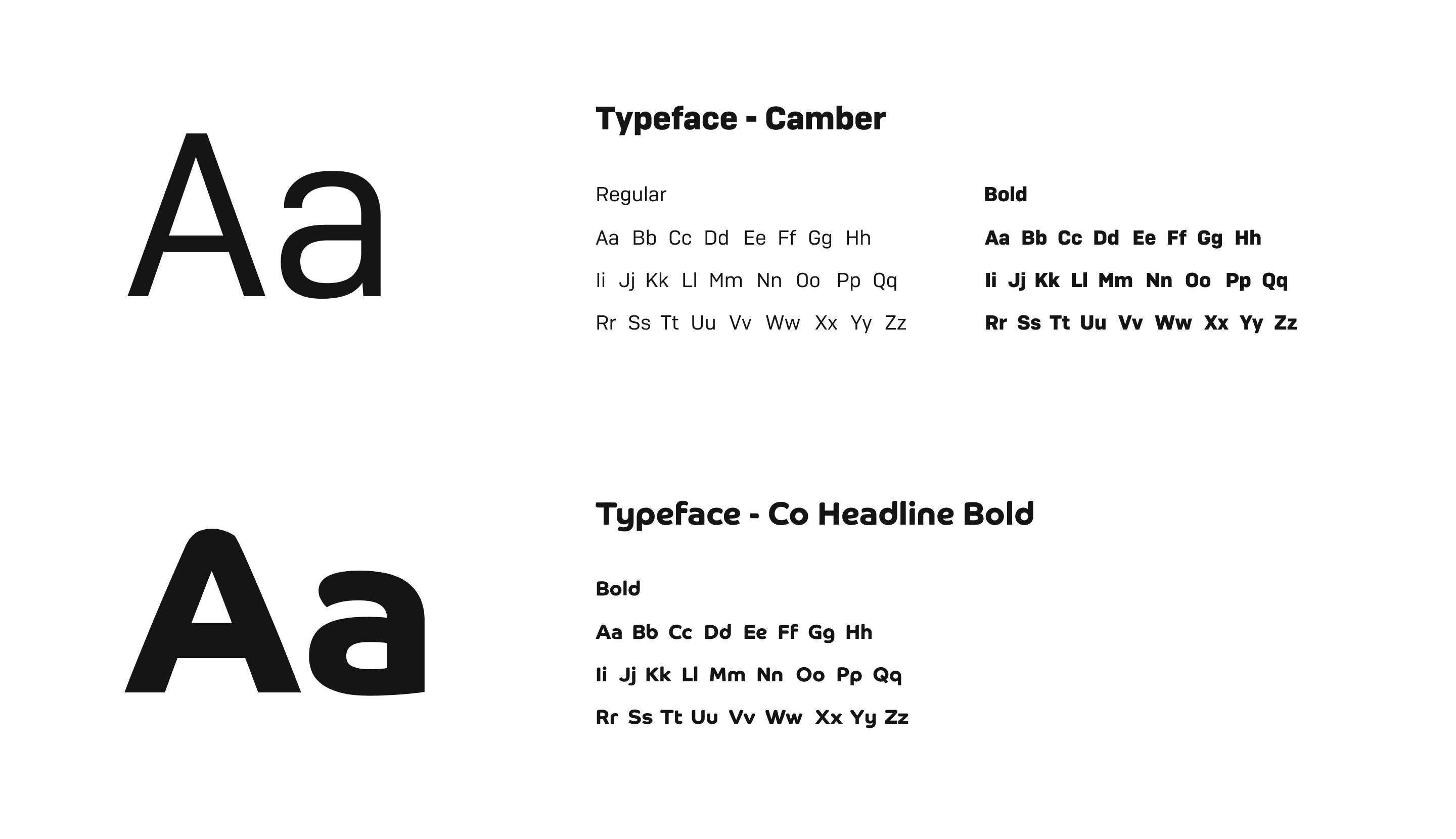
Typography
Camber
A geometric sans-serif with rounded terminals and even stroke weight. Feels approachable yet structured — works well for body copy and supporting text where readability matters.
Co Headline Bold
A high-impact display face with tight tracking and strong vertical stress. Built for large format — headlines, posters, signage. The weight commands attention without needing much else around it.
Final Designs
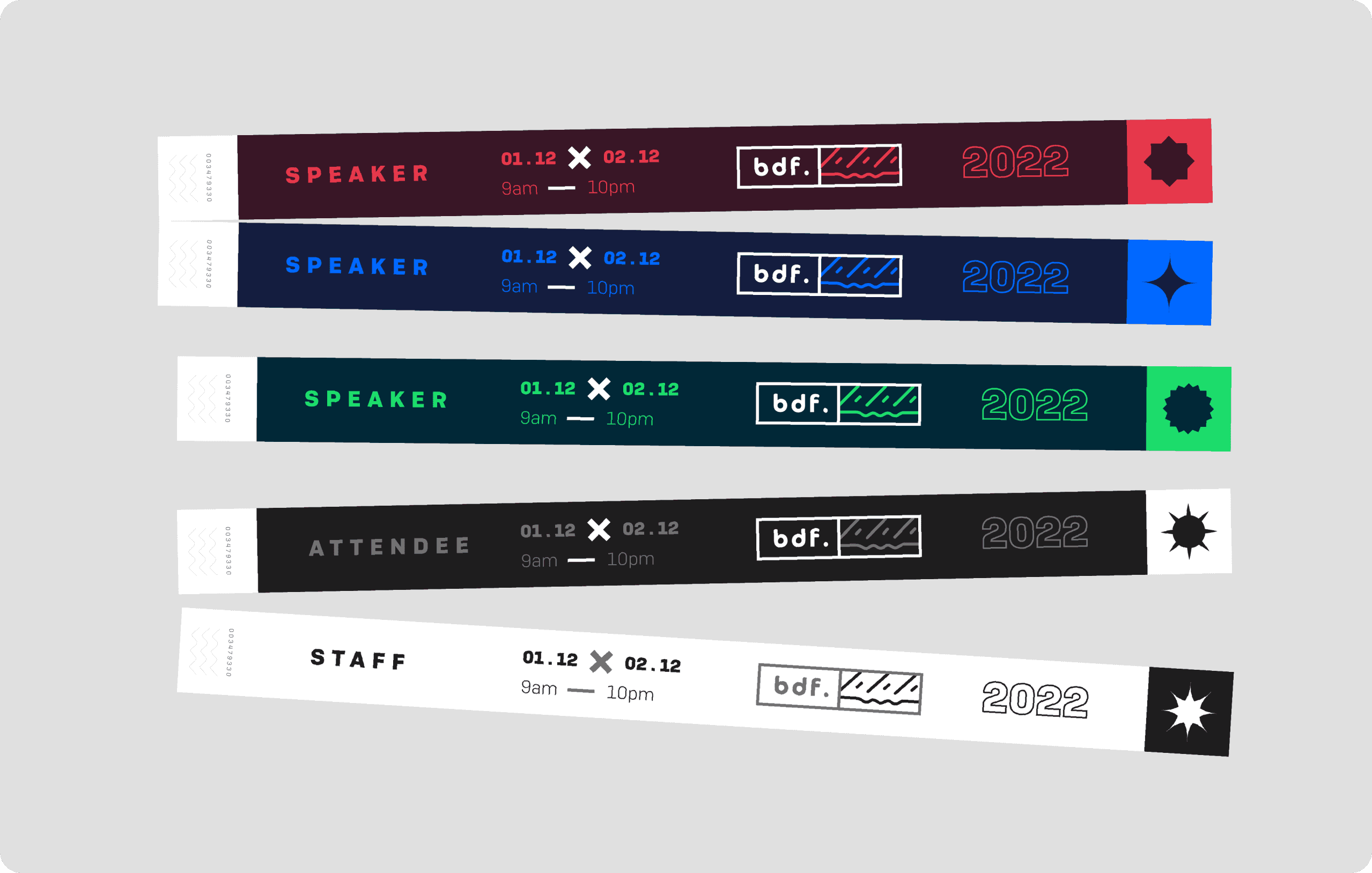
Hand Bands
Minimal wristbands with the BDF mark for event access control.
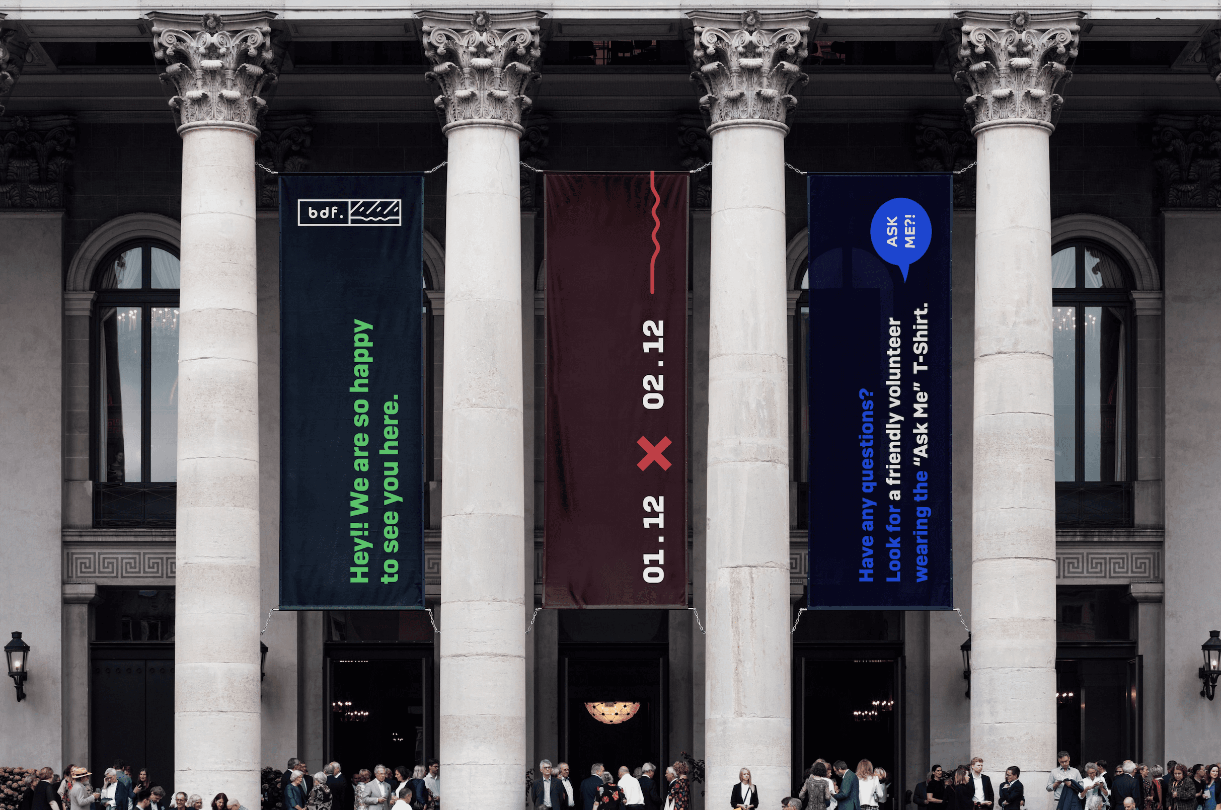
Flag Banner
Tall-format banners lining the venue entrance, turning the street into a branded corridor before you even step inside.
Speaker Poster
Large format, bold typography. Designed to command attention on walls and social.
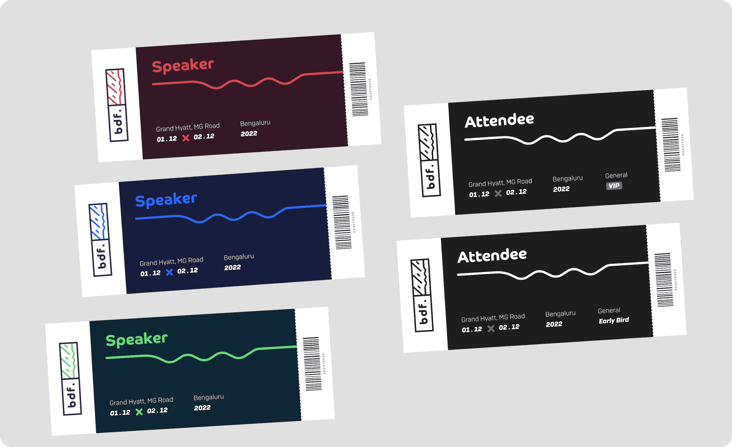
Ticket Design
Multi-tier ticketing system with clear hierarchy between day passes and full conference access.
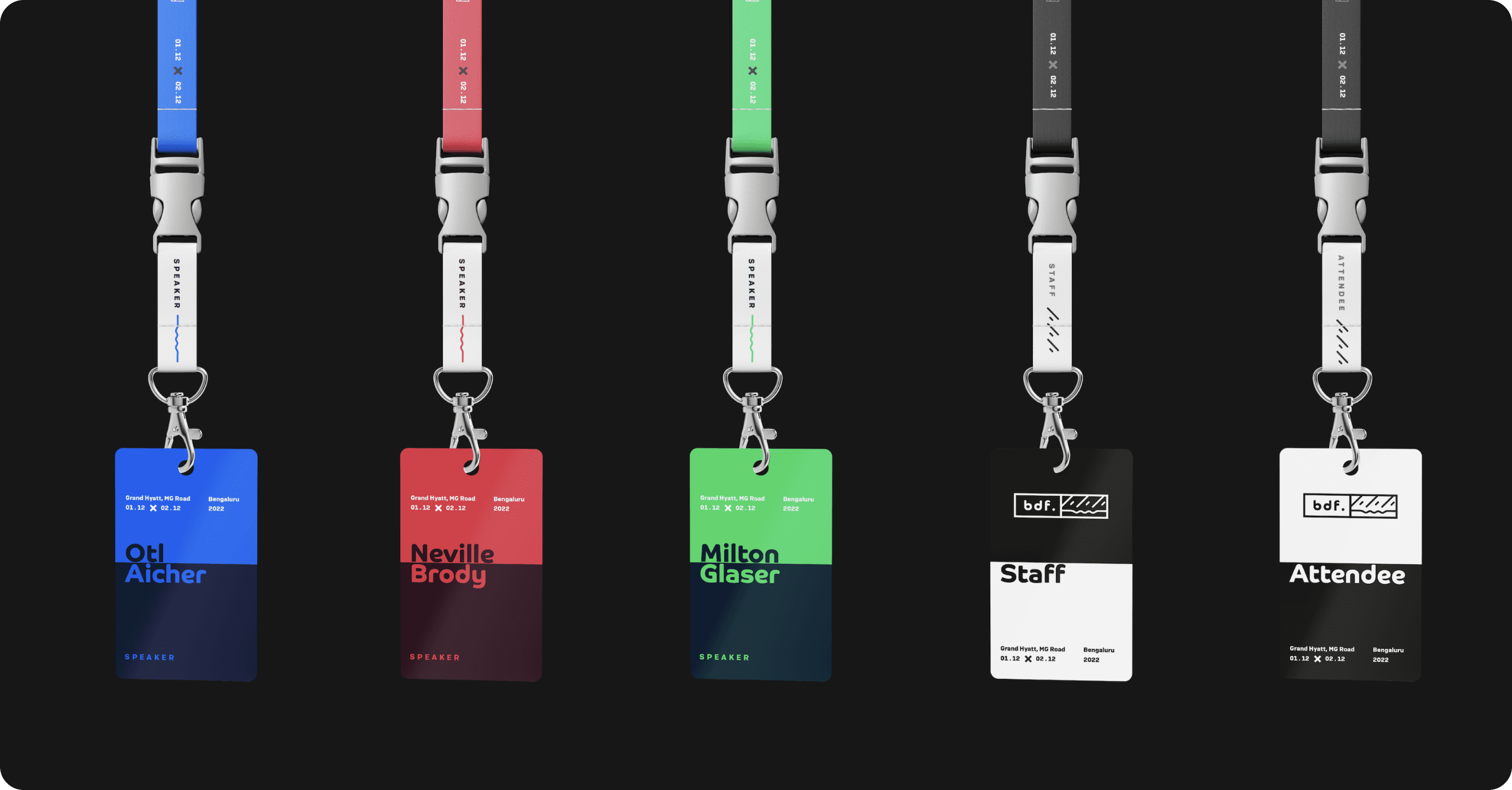
ID Card
Color-coded by role (speaker, attendee, crew). Functional and on-brand.
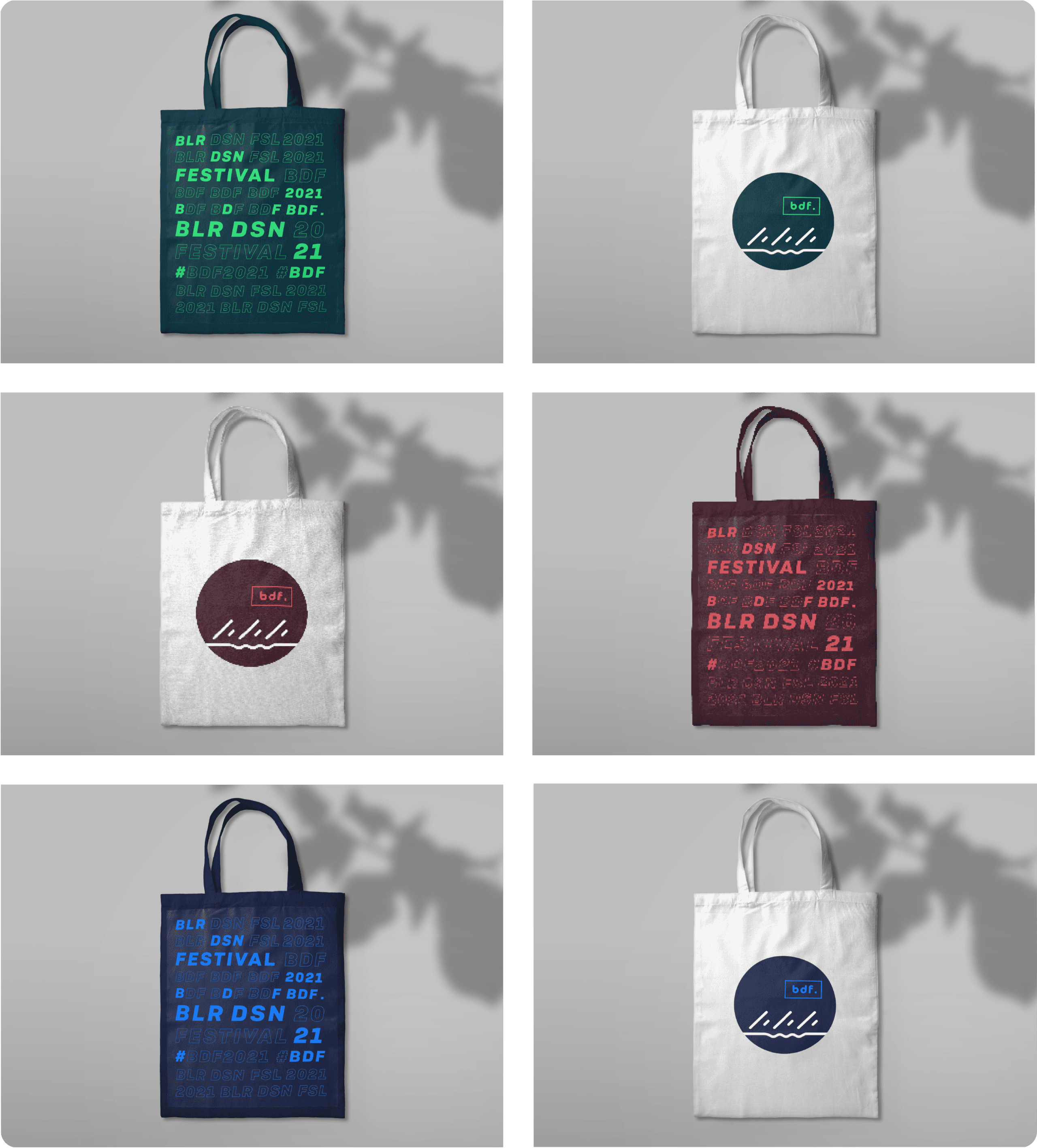
Notebooks
Merchandise that people actually want to keep. The tote uses the full-bleed wordmark.
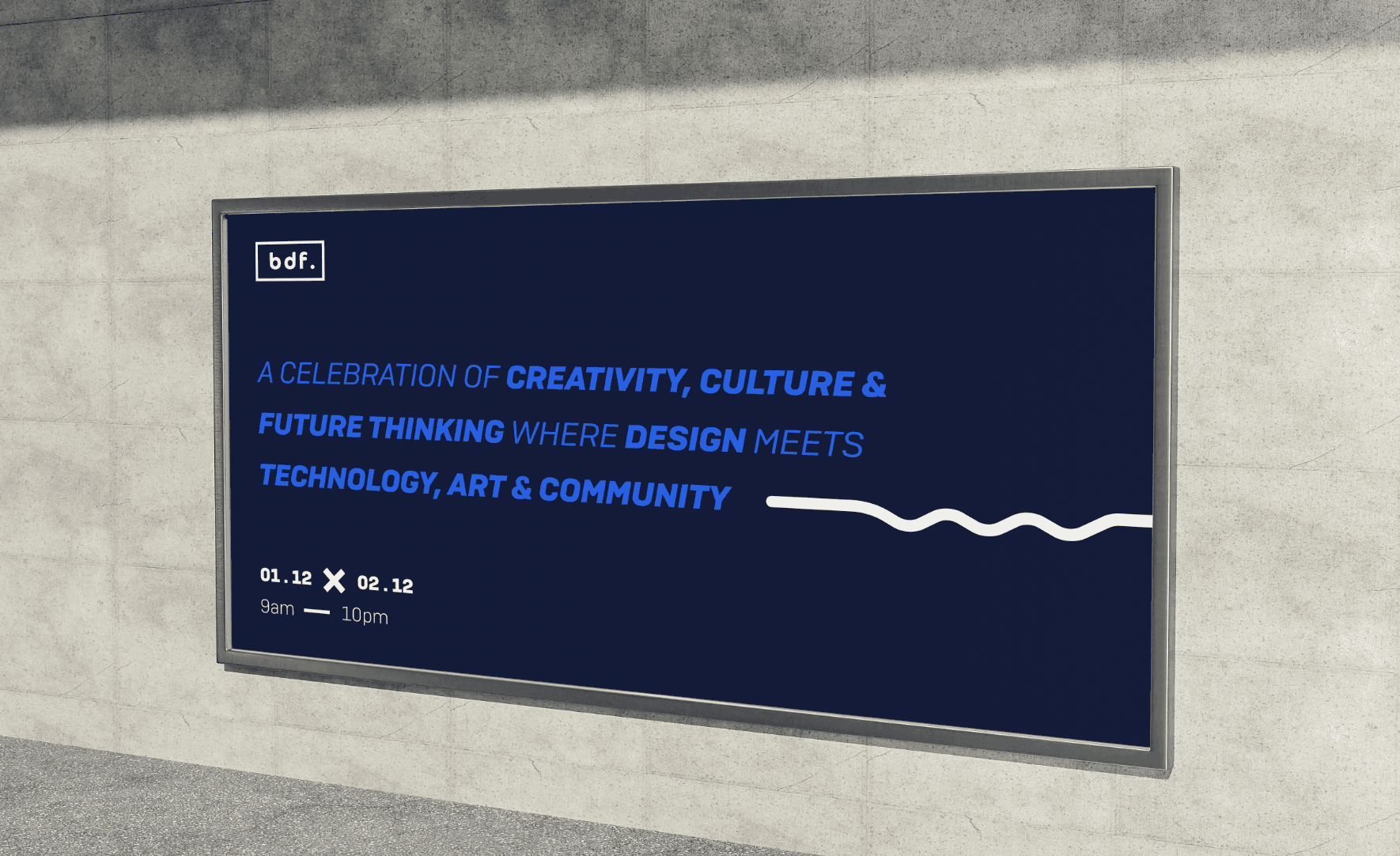
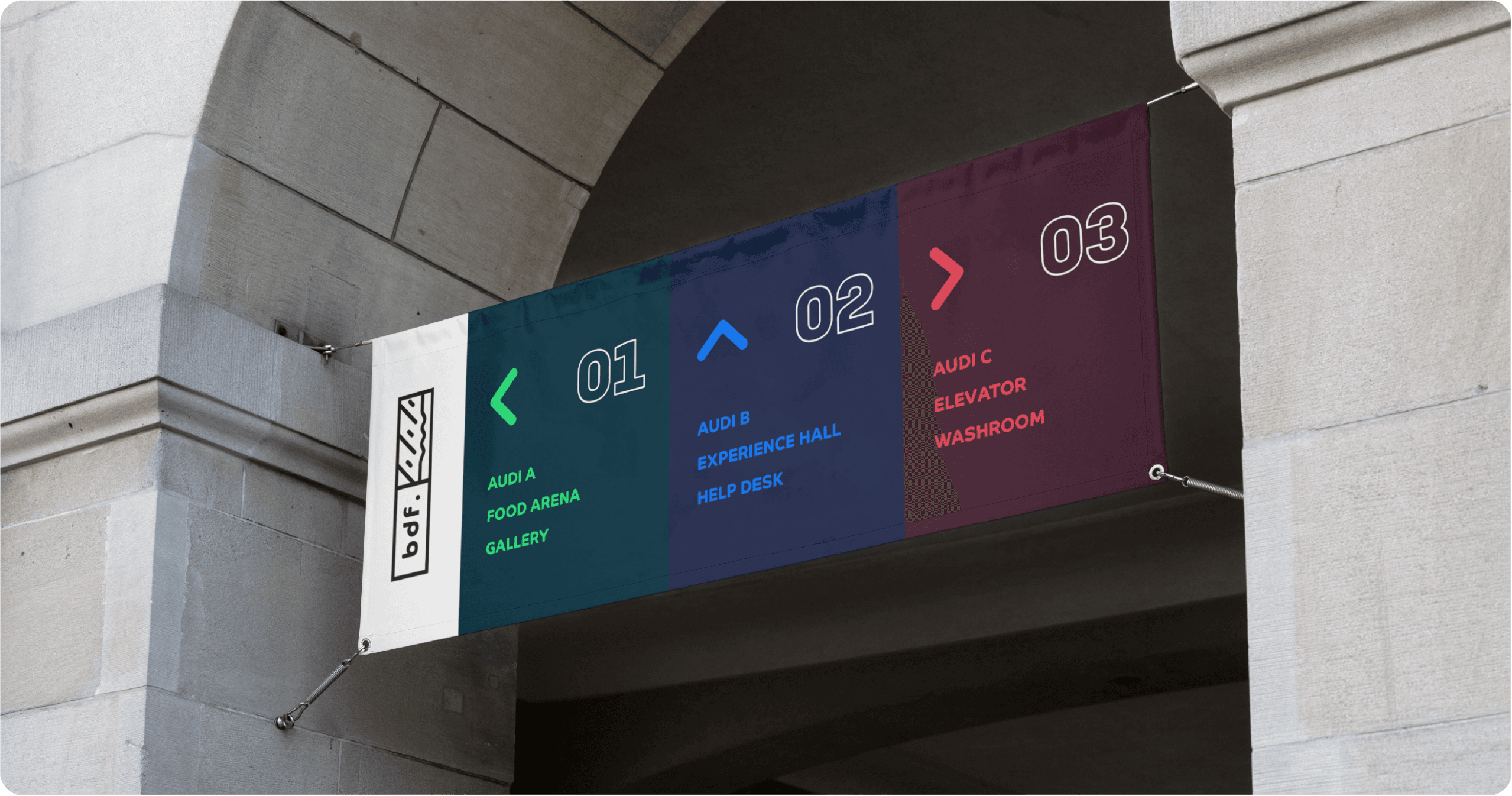
Signage
Environmental graphics for the venue: wayfinding, stage backdrops, and digital signage.
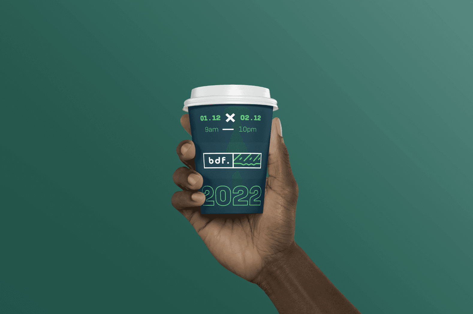
Coffee Cups
Branded takeaway cups for the festival café. The BDF mark wraps around the sleeve — one of those small details that makes the whole experience feel considered.
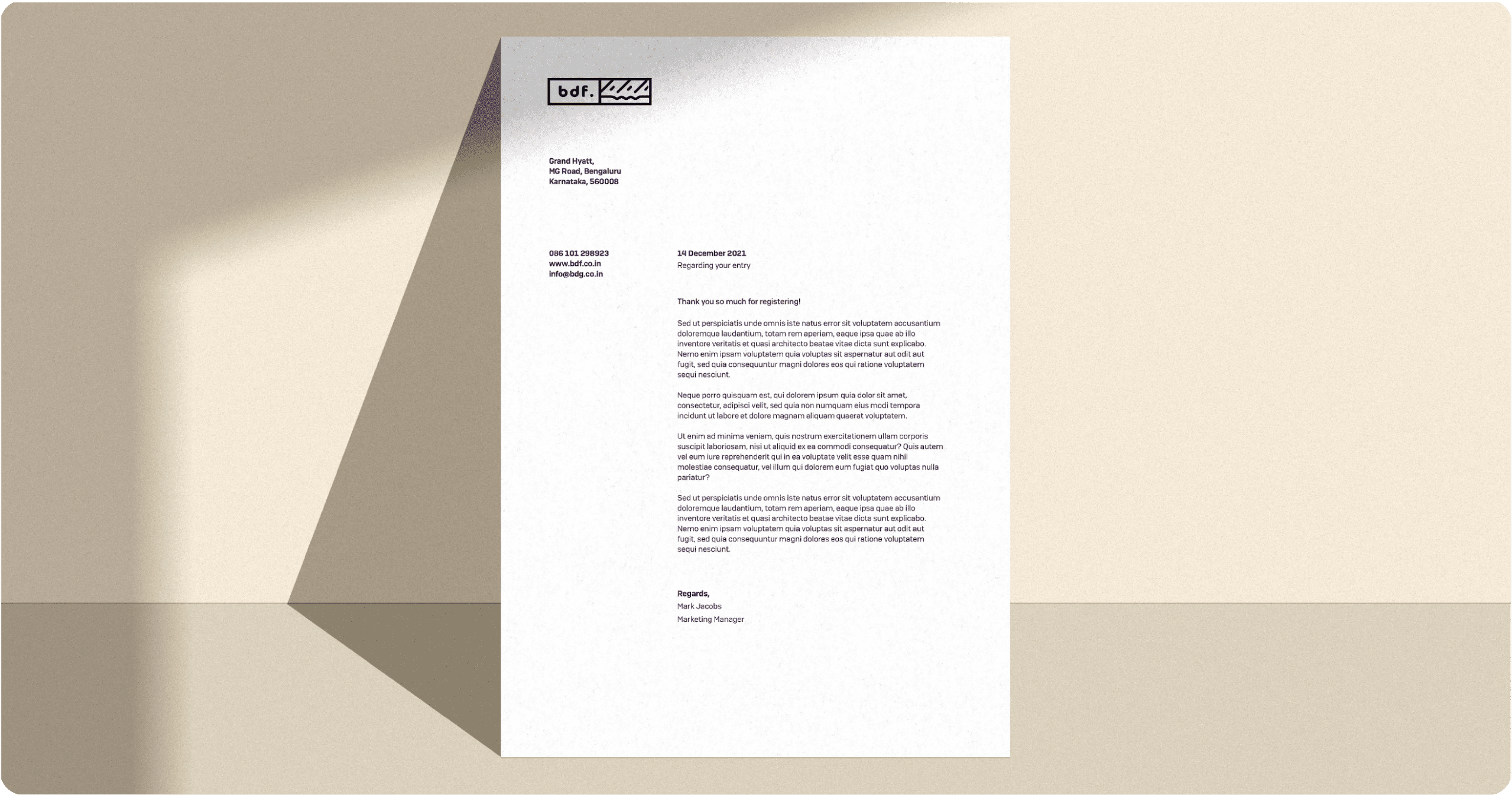
Letterhead
Clean official stationery for speaker outreach, sponsorship decks, and partnerships. Minimal layout, the wordmark doing the heavy lifting.
Reflection
This was an exercise in building a complete brand system from scratch — not just a logo, but every touchpoint a person would encounter at the event. The constraint of a hypothetical brief gave freedom to push the visual language further than a real client brief might allow.