Crossbeats
To craft a digital experience that not only showcased the cutting edge features of Crossbeats audio devices but also provides a feel of staying fit.
Project Type
UI/UX Design | Responsive Design
Domain
E-Commerce
Product
https://crossbeats.com/


Overview

Who is the audience?
Active Individuals/Fitness Enthusiasts
What will they use this platform for?
A wholesome website experience created for our audience so that they know about the new products and soak in the brand experience of Crossbeats.
Where is the current pain?
Lack of affordable sports audio wear in the market for the average fitness enthusiast audience
Why will they need audio product?
This product aims to deliver a premium audio experience, enhancing the user’s enjoyment of music during their fitness activities.
Role In The Project
As the lead UI/UX designer for the Crossbeats project, my role was multifaceted and crucial to the project's success.
I spearheaded the entire design process, from conceptualisation to implementation, ensuring that every aspect of the user interface and experience aligns with Crossbeats' brand identity and user expectations.
Milestone for the brand after design delivery
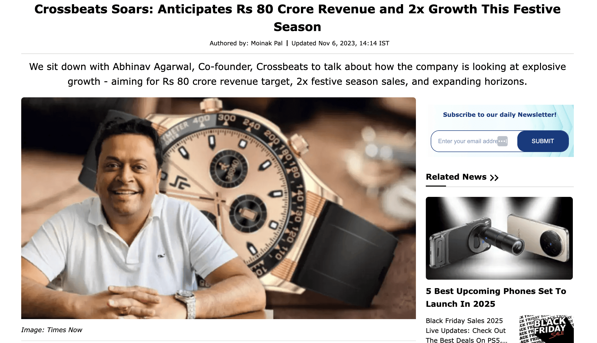
A revenue of 9.6 million USD or 800 million INR. 2x Growth for the brand during the holiday season
Challenges and problems to solve
Low brand recognition in a compeitive smart audio market made it difficult for Crossbeats to establish a clear presence.
Existing brand identity and only an Amazon website presence lacked emotional connection or distinction, limiting user engagement and recall.
Needed to reposition the brand to appeal to a younger, lifestyle-focused audience without losing its core tech-driven identity.
Maintaining a cohesive brand language which is a mixture of Beats and Bose.
Process
Discover
In this initial phase of the discovery process, the design team met with the client to gain a comprehensive understanding of the project's requirements and problem statement—identifying the challenges or goals that the design solution should address.
Simultaneously, we interviewed fitness enthusiasts to gather insights into their audio device needs. These interviews aimed to gather firsthand insights into the preferences, challenges, and expectations of potential users.
We conducted extensive market research, thoroughly analysing competitor brands for their style and identity. There were some brands to compare Beats and Bose.
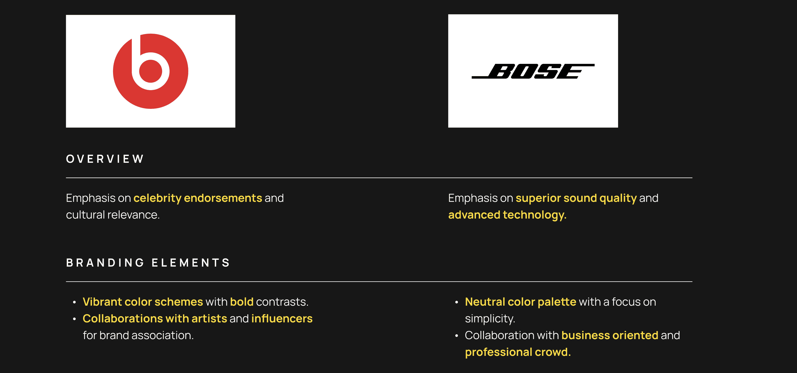
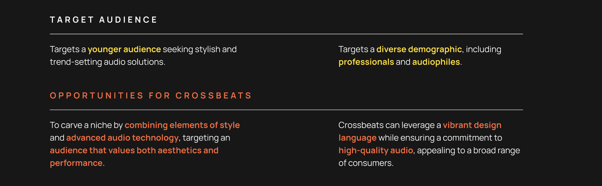
Competitor Analysis
Define
In the Define phase, the design team meticulously organised and analysed data collected during the discovery phase. This step involved distilling key insights and patterns from client meetings, market research, competitor analyses, and user interviews.
Users, particularly those with active lifestyles, seek a seamless blend of style and advanced audio technology.
We crafted user personas by defining the target audience's demographics, behaviours, pain points, and goals. This process humanised the target users and provided a reference for user-centred design decisions.
Ideate
In this ideation stage, the design team leveraged collaborative brainstorming sessions to generate a pool of creative and innovative ideas.
Additionally, we crafted a concise journey map to outline user touchpoints and emotional states throughout the product experience.
To translate ideas into tangible design elements, the team focused on constructing the Information architecture to organize and structure content logically.
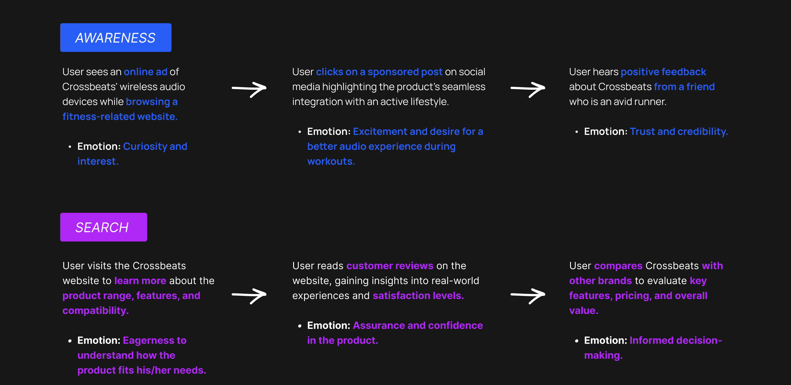
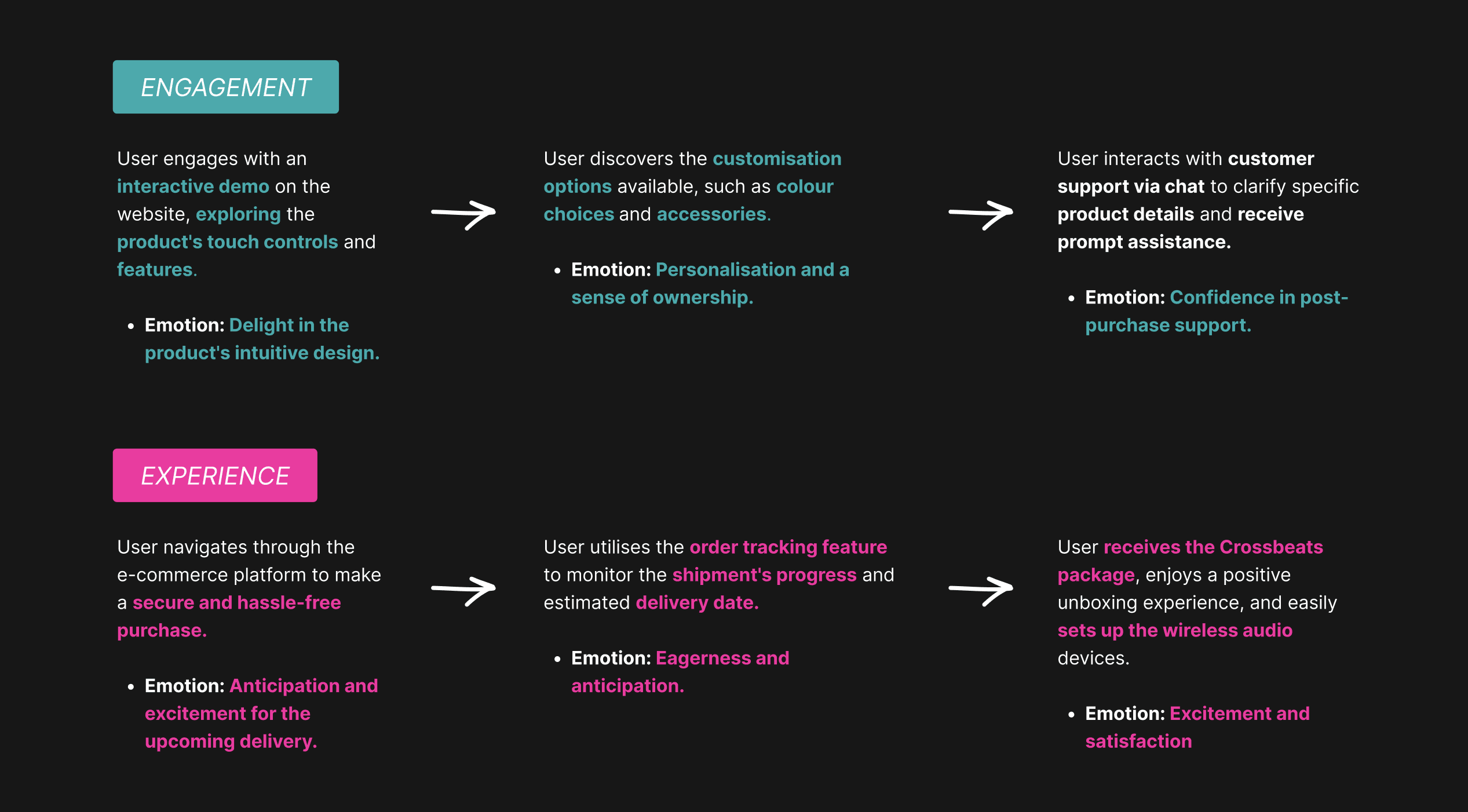
Journey Map
Build
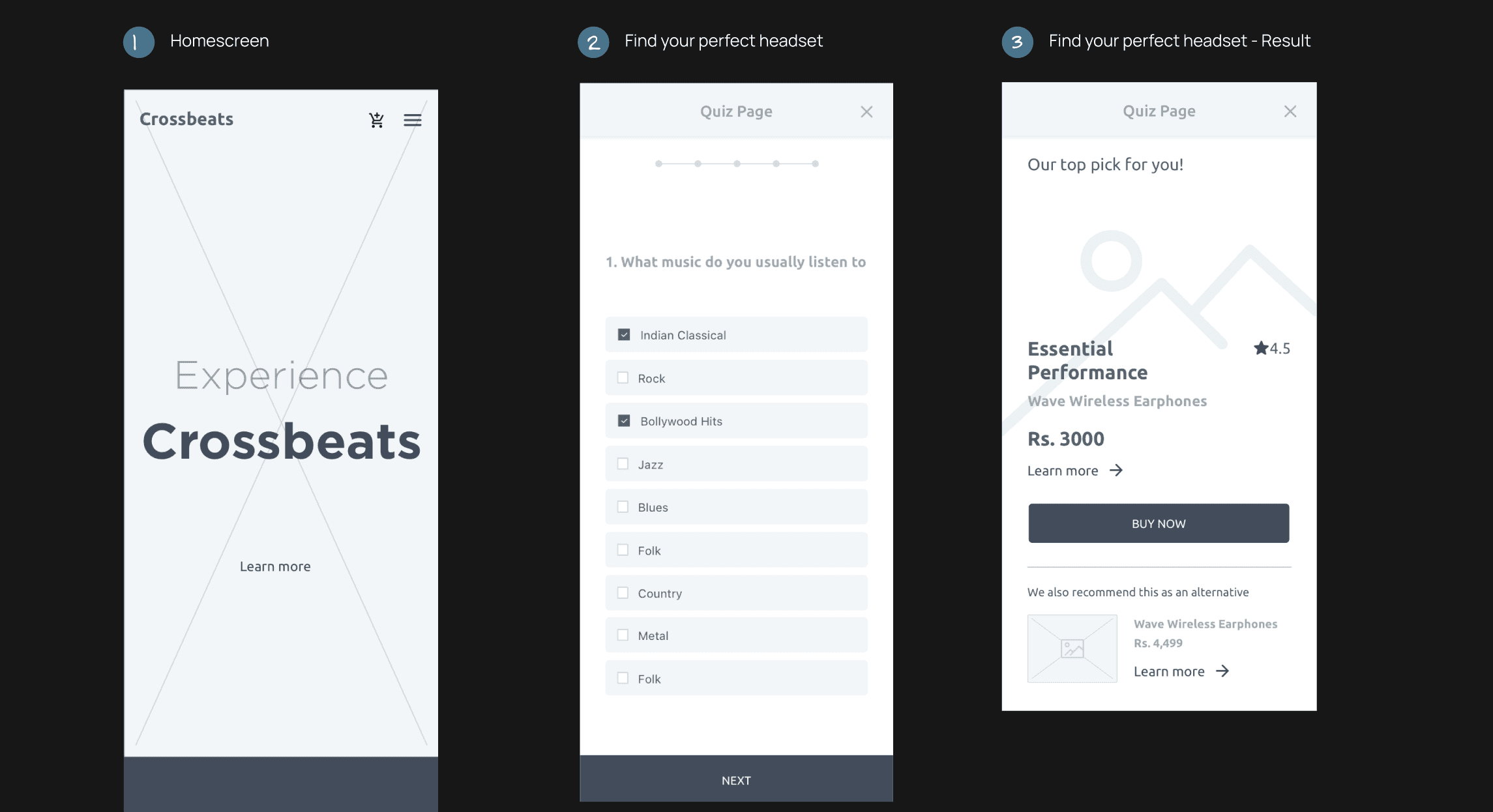
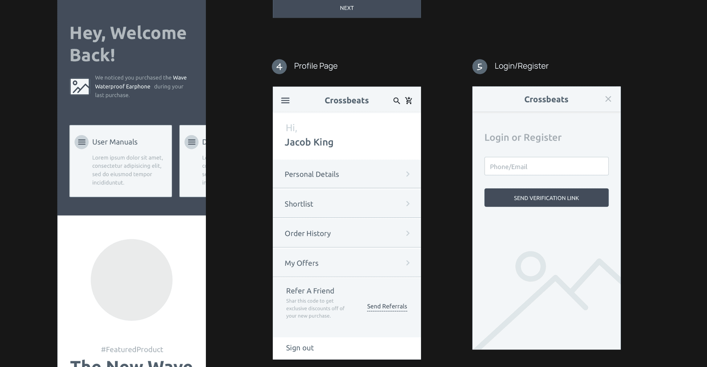
Develop wireframes and prototypes to visualise the user journey and interactions.
Incorporate feedback from stakeholders, usability testing, and iterative design processes.
Finalise high-fidelity designs and create interactive prototypes for user testing.
Deliver
Collaborate with the development team to make the design a reality.
Perform thorough testing of the product for functionality, and performance.
Few moments while building the product
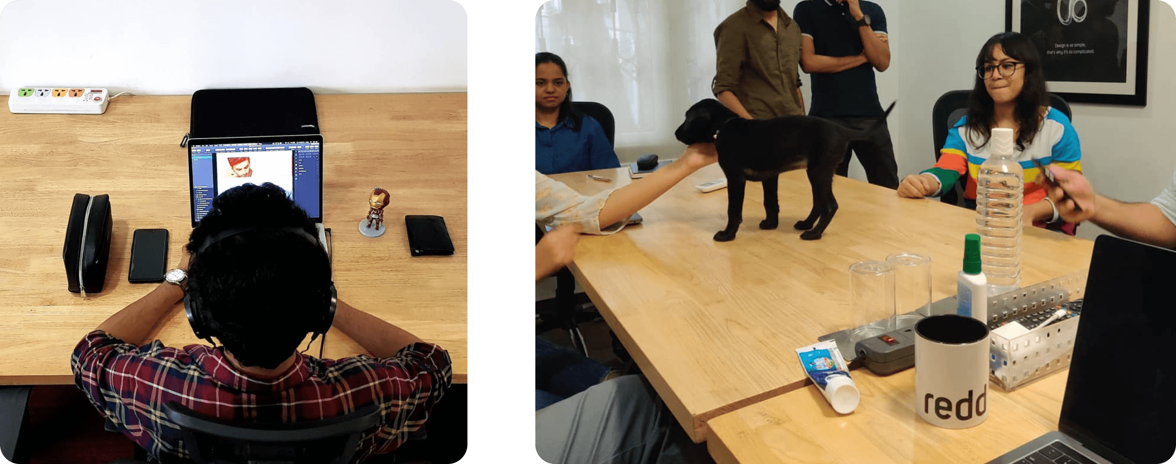
Image 1: This is me, highly focused, doing the only thing I truly love to do - Design!
Image 2: Stress relief with our office dog - Lola!
Wireframes
Colours
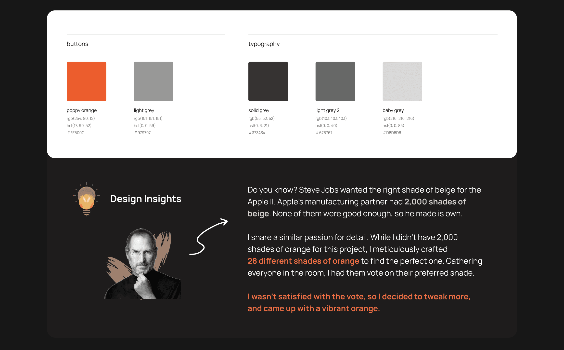
Typography
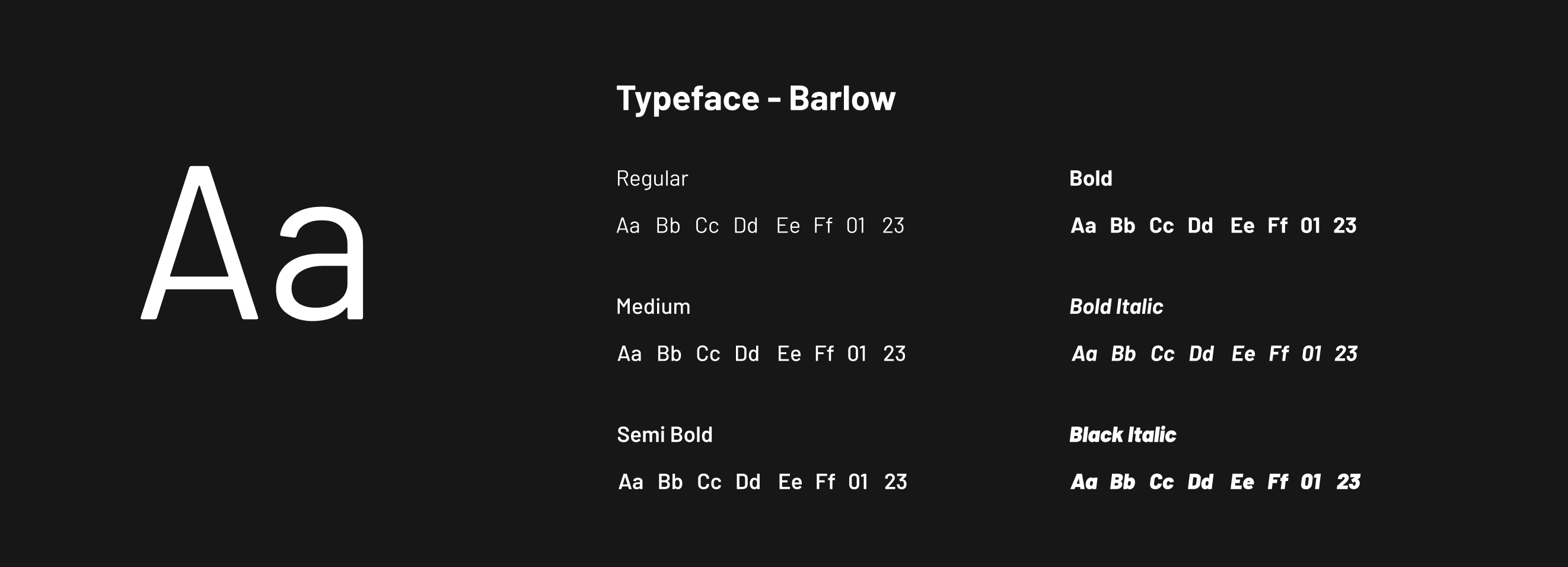
Barlow was used entirely in Crossbeats platform.
It is bold and an edgy font that will highlight the active brand language of Crossbeats.
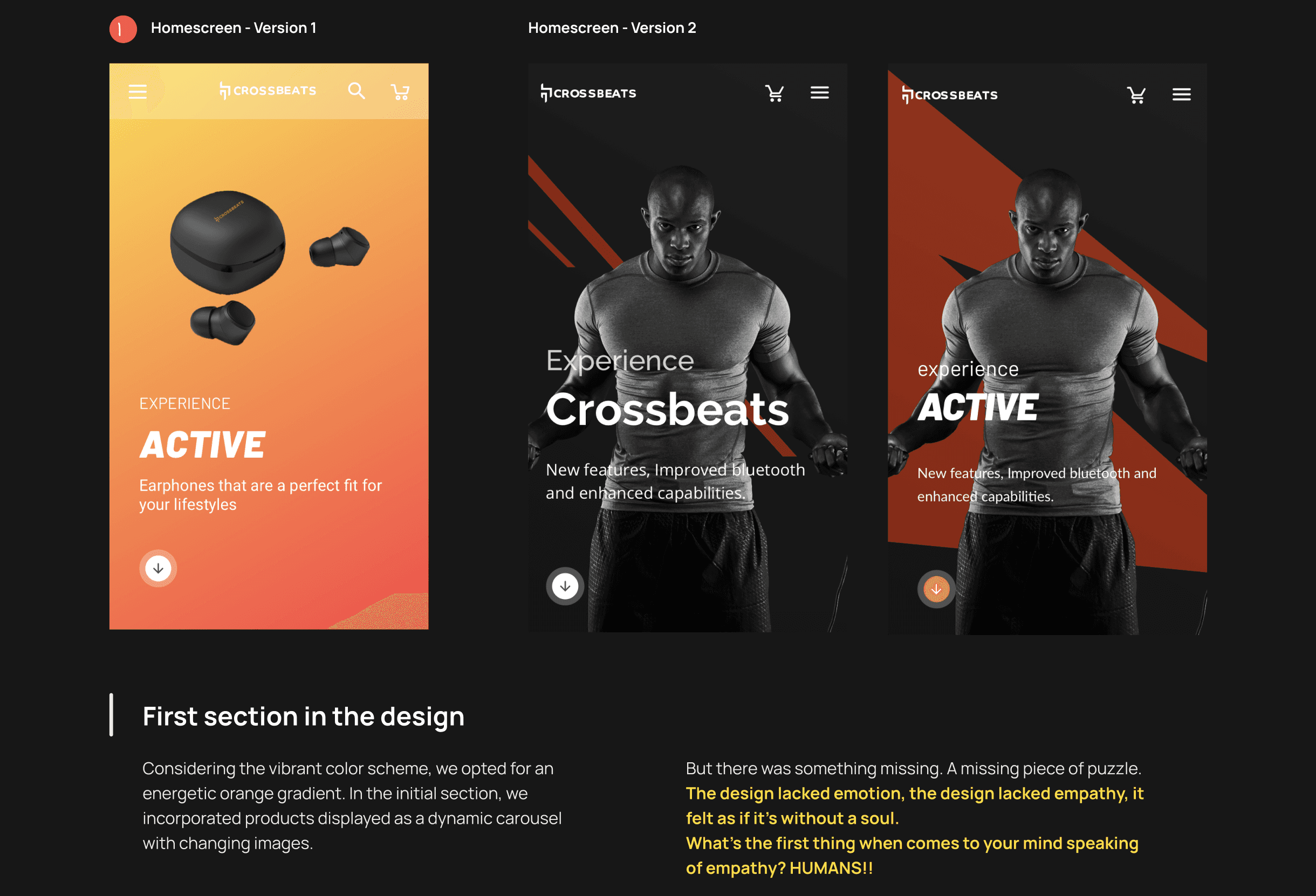
Visual Design Plan
Address challenges of maintaining simplicity and vibrance while showcasing cutting-edge features.
Aim for Crossbeats to stand out in the competitive landscape of audio devices.
Ensuring that each visual component serves a purpose in enhancing user engagement.
Utilise gradient schemes, typography, imagery, and intuitive navigation for a harmonious blend.
User’s Feedback 💬
The refreshed identity made Crossbeats feel more premium and better aligned with lifestyle-tech expectations.
Users appreciated the improved trust and recognizability, especially across key touchpoints for first-time buyers.
Impact 💥
The rebrand increased brand recall and visibility in a crowded D2C space.
It drove a 30% rise in returning users and helped position the brand as lifestyle-driven, resonating more with younger audiences.