Juspay
Juspay aimed to create a fluid payment system that could seamlessly integrate with prominent applications such as those for food delivery, ride-hailing, and e-commerce platforms.
Project Type
Product Design Mobile, User Research
Domain
Fintech
Product
https://juspay.io/europe


Overview

Who is the audience?
Users frustrated with cluttered payment apps who value speed and simplicity.
What is the pain?
Cluttered interfaces with too many options cause confusion and decision paralysis. Users feel anxious about paying wrong amounts.
Where is the current pain?
Throughout the payment flow - selecting recipients, entering amounts, confirming transactions, and tracking payment status.
Why will they need this product?
They need payments as simple as texting - minimal steps, conversational interface, and clear confirmations that build trust.
Role In The Project
I collaborated with the team, taking the lead designer role in crafting the user experience and user interface for the entire project.
Designing a minimalistic interface required extensive research and effort.
Challenges
Traditional payment platforms typically operate as standalone apps, occupying the entire screen interface.
In this project, however, Juspay is a payment gateway which was integrated into other apps when a user is making the payment, it needed to seamlessly function within a smaller 1/3 portion of the screen.
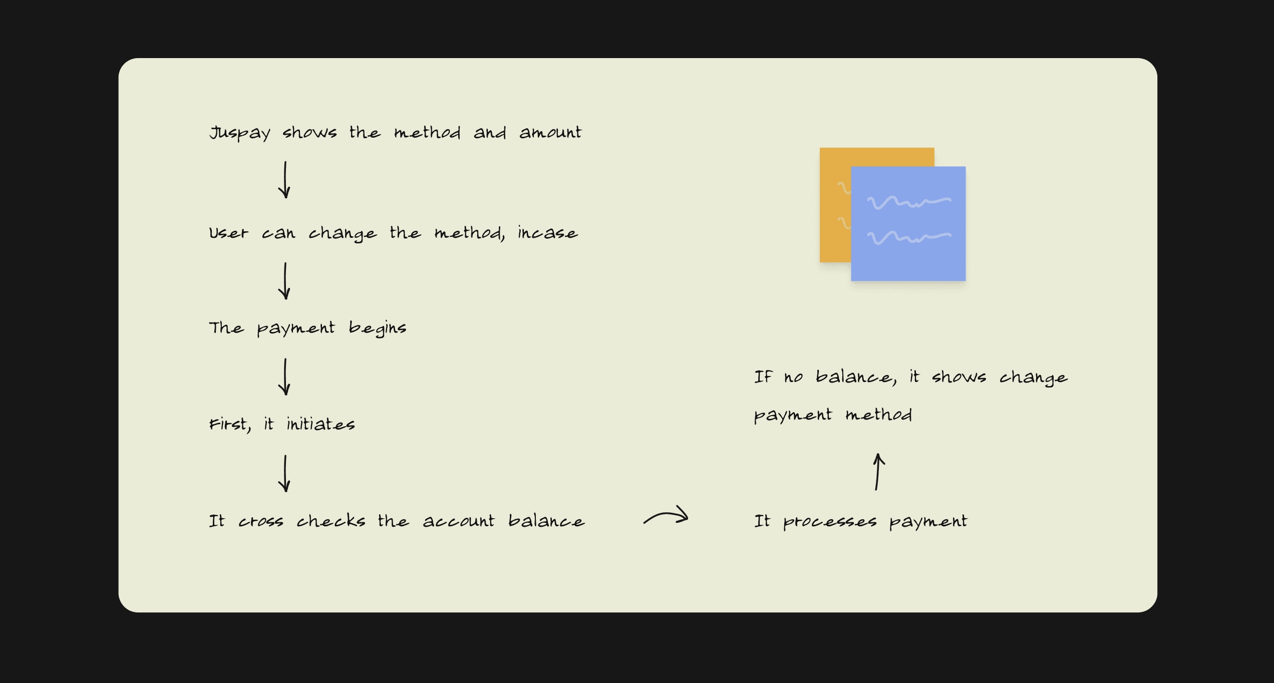
How payment happens
We began by sketching out how payment happens and at what point the user would require the appropriate options to proceed.
Design: Minimal at it’s core. Given that the UI Design occupies only one-third of the screen, the rounded corners add a playful touch.
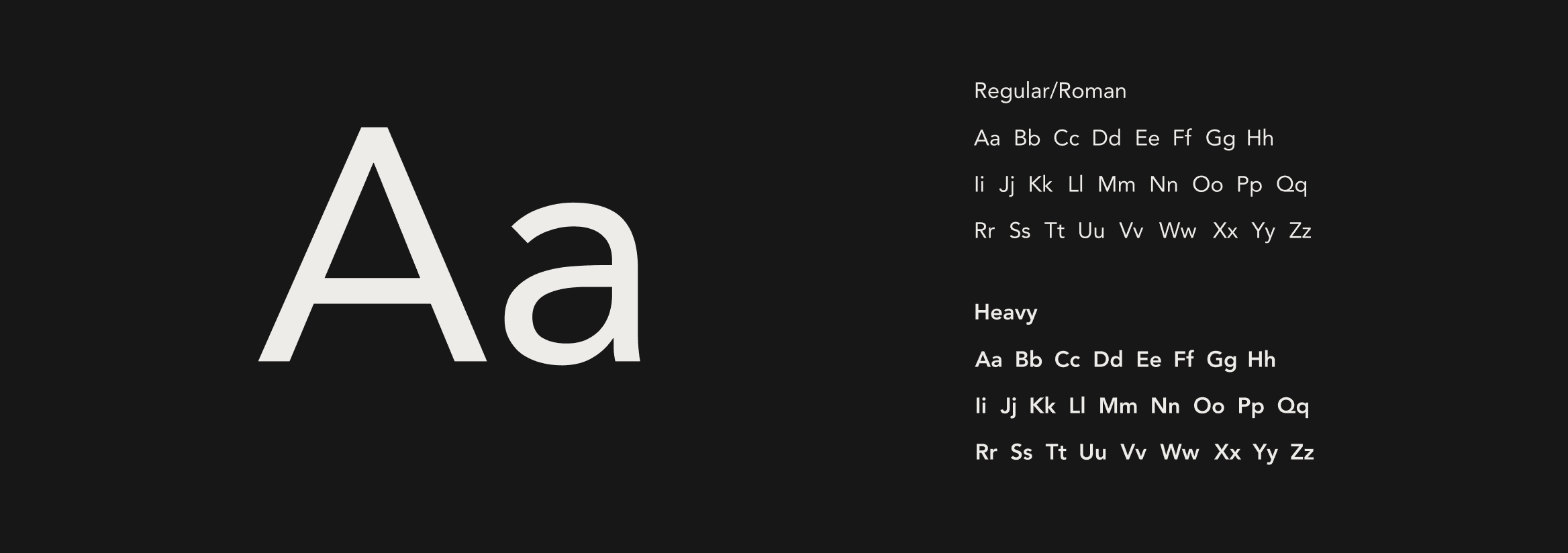
Typography
Avenir was used entirely in the app.
With emphasis on beautiful rounded edges, the font compliments well with the character of the brand.
First Design Concept
The concept was bold and basic when we started the design phase, with thick icon strokes and fewer rounded boxes.
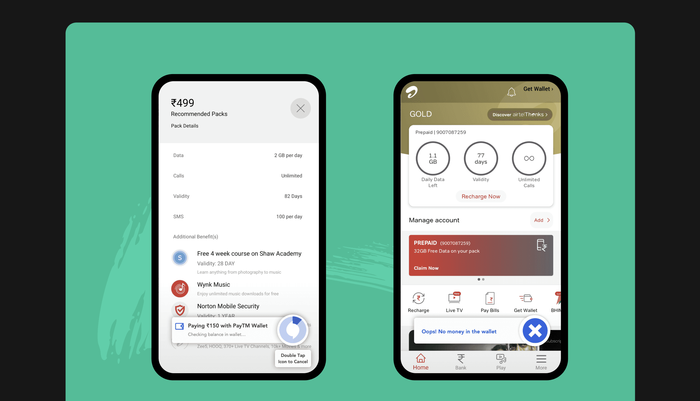
Since Juspay is an integrated payment gateway into other apps, we tried to make experiences for two applications: Airtel Telecom and Swiggy Food!
Second & The Final Design Concept
We wanted to take a cleaner approach after the first UI design.
To draw attention, we devised a more comprehensive approach that included the use of icons with two colors. To make the Juspay button feel more integrated, it was moved inside the box.
Designing the style
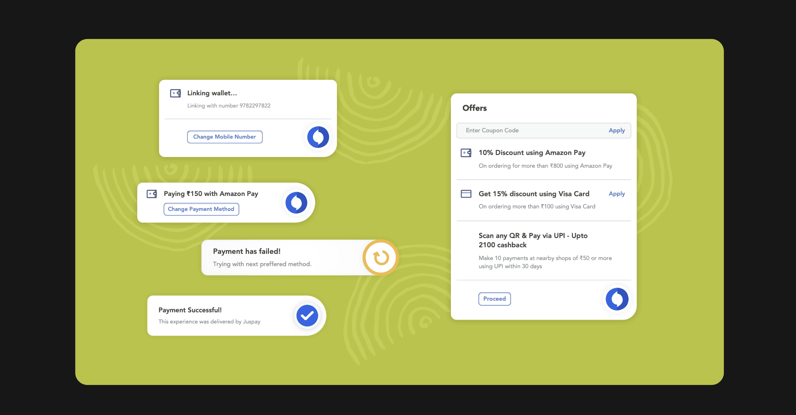
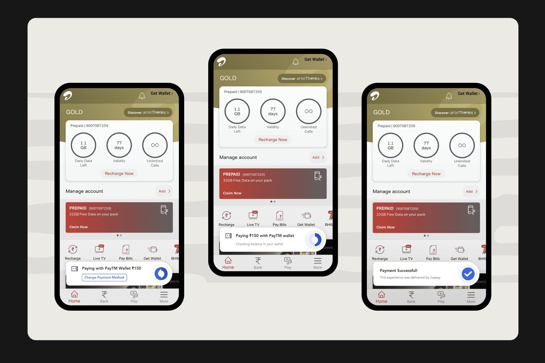
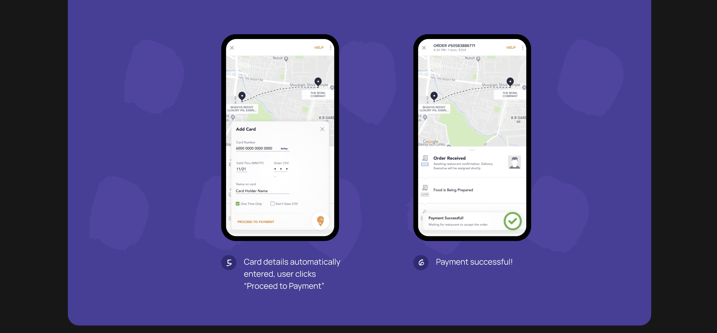
The flow illustrates the functioning of Juspay payments, emphasizing that the payment occurs seamlessly in the background.
The Juspay user interface occupies just one-third of the screen.
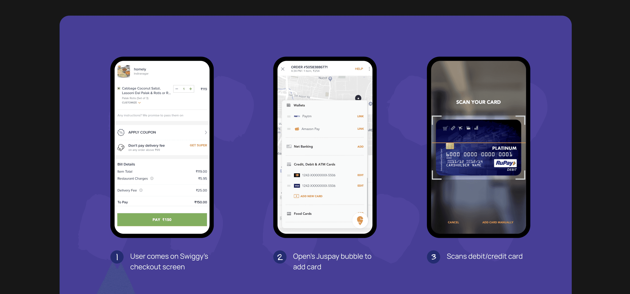
Add New Card - App: Swiggy Food
If the user has to add new card, Juspay let’s you scan your card seamlessly like butter!
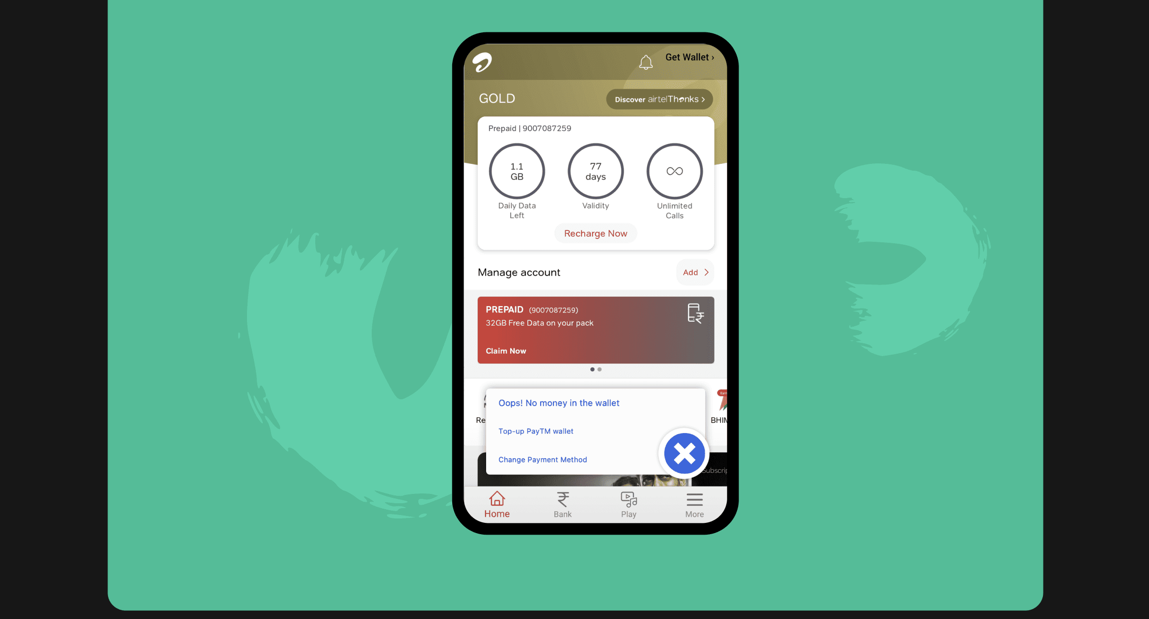
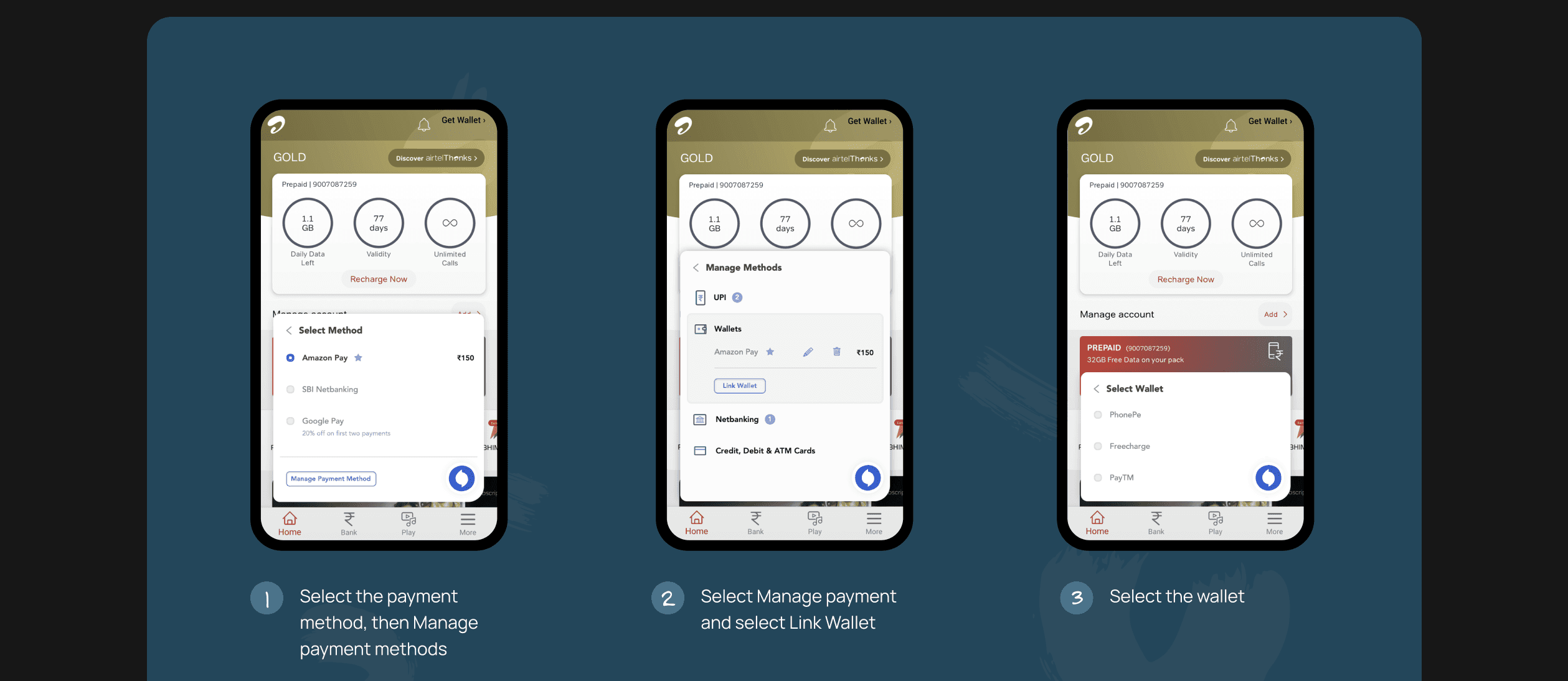
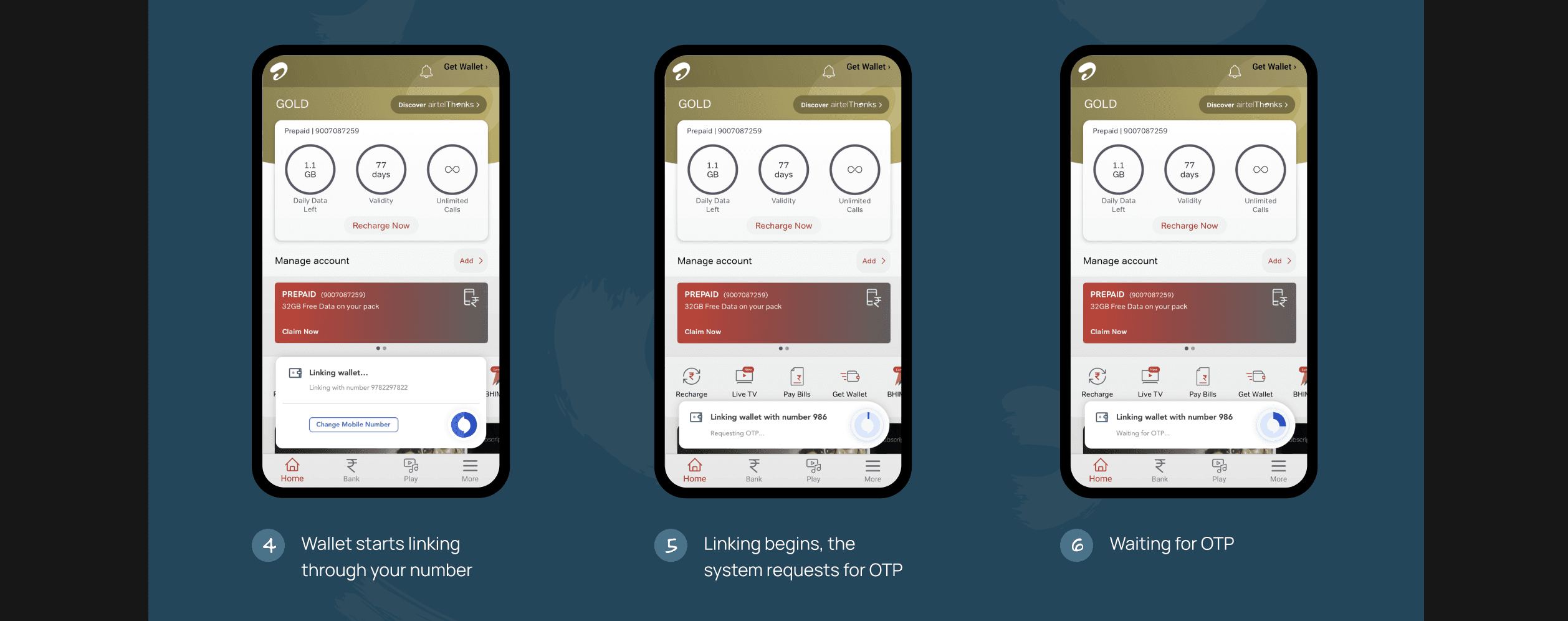
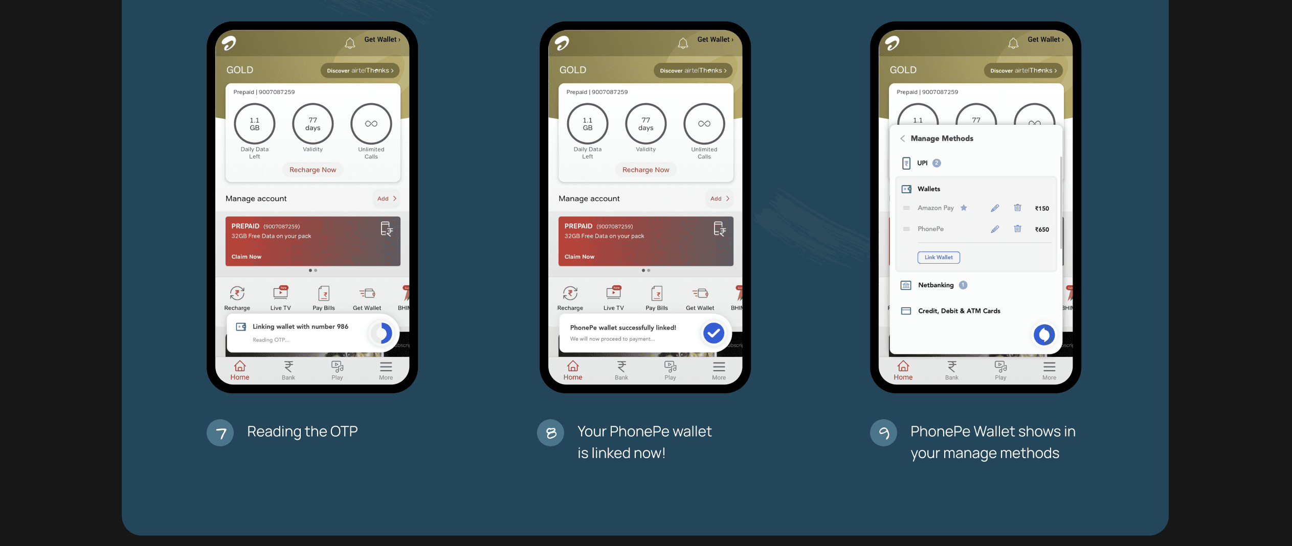
Link your wallet - App: Airtel
Manage methods will take you to a screen where you may view more payment options. To add a new wallet, tap Link Wallet. The final six displays how the interface appears when it is linked.
User’s Feedback 💬
Users expressed their admiration for the seamless integration of the payment interface, highlighting how pleasantly surprising it was that it occupied only 1/3 of the screen.
They appreciated that this minimalistic design did not disrupt the overall user experience and found it non-intrusive.