Loose Goose Brewing Co.
Identity and packaging system for a local craft brewery. The design rejects typical beer cliches, focusing instead on the relaxed energy of unplanned afternoons and spontaneous neighborhood gatherings.
Project Type
Brand & Packaging Design
Domain
Food & Beverage


Overview

Who is the audience?
Locals, craft beer enthusiasts, and neighborhood residents looking for a relaxed, unhurried space to gather and connect.
What is the brand's purpose?
To serve as a neighborhood "Third Place"—a relaxed, unhurried sanctuary built entirely for spontaneous human connection and unstructured leisure.
What was the challenge?
Breaking away from the over-intellectualized elitism of modern craft beer culture to build an identity rooted in raw, authentic approachability.
Why does this matter?
It shifts the brewery from just a commercial drinking spot into a vital community anchor that celebrates real-world presence and shared neighborhood stories.
The Core Tension
Craft beer branding is crowded with predictable cliches: intricate heritage badges, aggressive animal mascots, and dense brewing jargon. Loose Goose needed to reject the gatekeeping.
The goal was to build a clean, structural visual system for a neighborhood craft brewery acting as a "Third Place"—a physical anchor for spontaneous local connection.

The Strategy
The visual system acts as a literal metaphor for "plans going out the window." By pairing a rigid, high-contrast grid layout with unexpected graphic interventions, the identity creates deliberate friction between structure and release.
It targets modern digital fatigue, shifting the brewery from a commercial drinking spot into a sanctuary where time slows down.
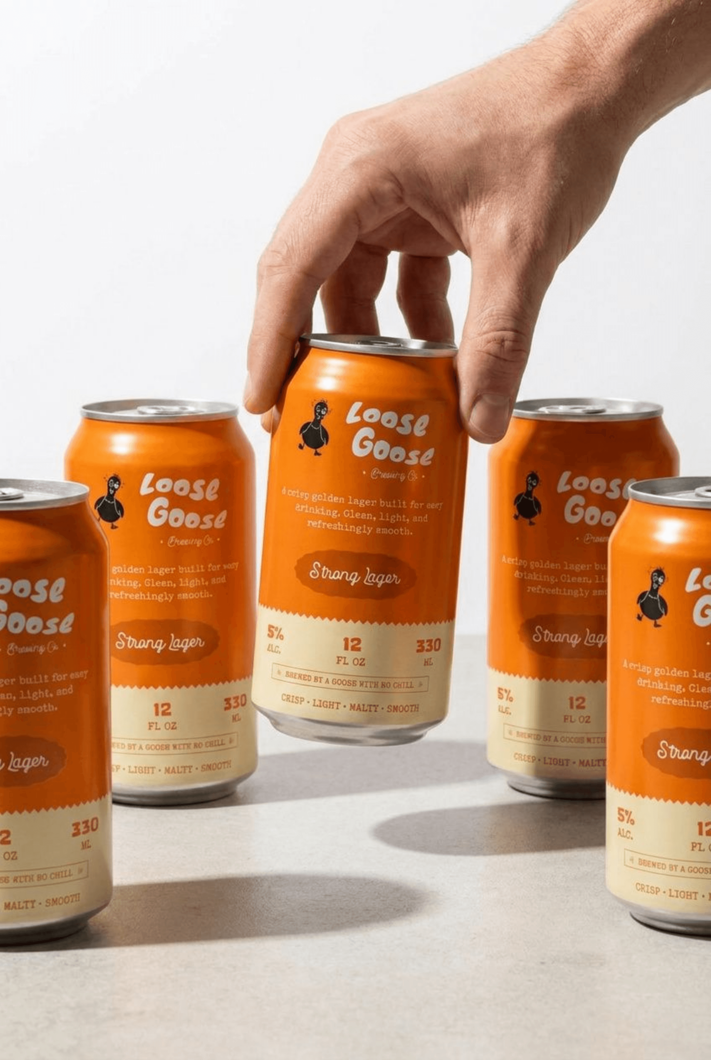
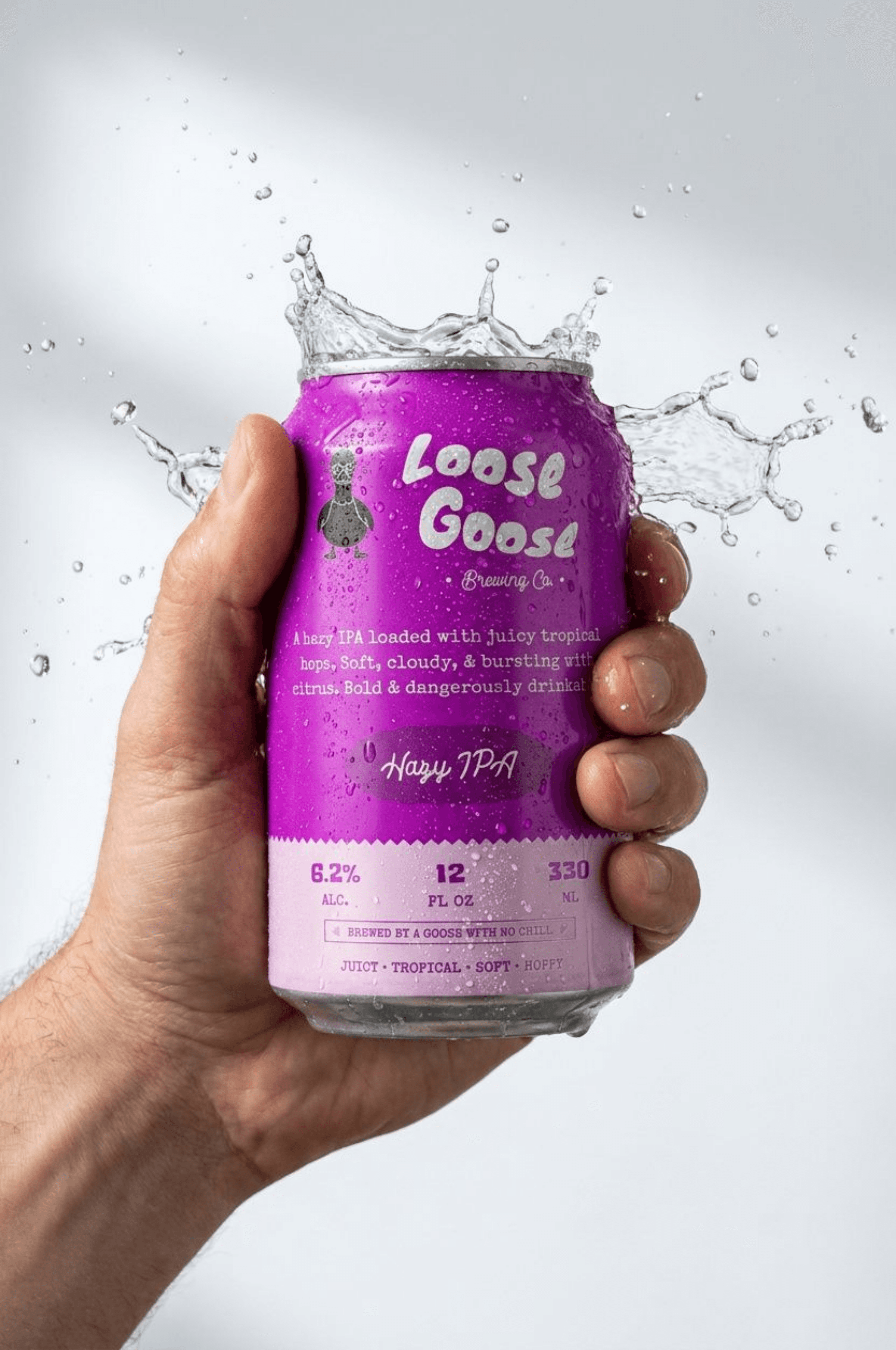
The Packaging Architecture
The Execution: High-contrast typographic grids, intense color blocks, and generous whitespace designed for immediate retail shelf disruption.
The Detail: The lower third houses clean, structured technical details (ABV, volume, and tracking) organized on a precise baseline grid, treating the physical can like a beautifully engineered component.

Wholesale Scale
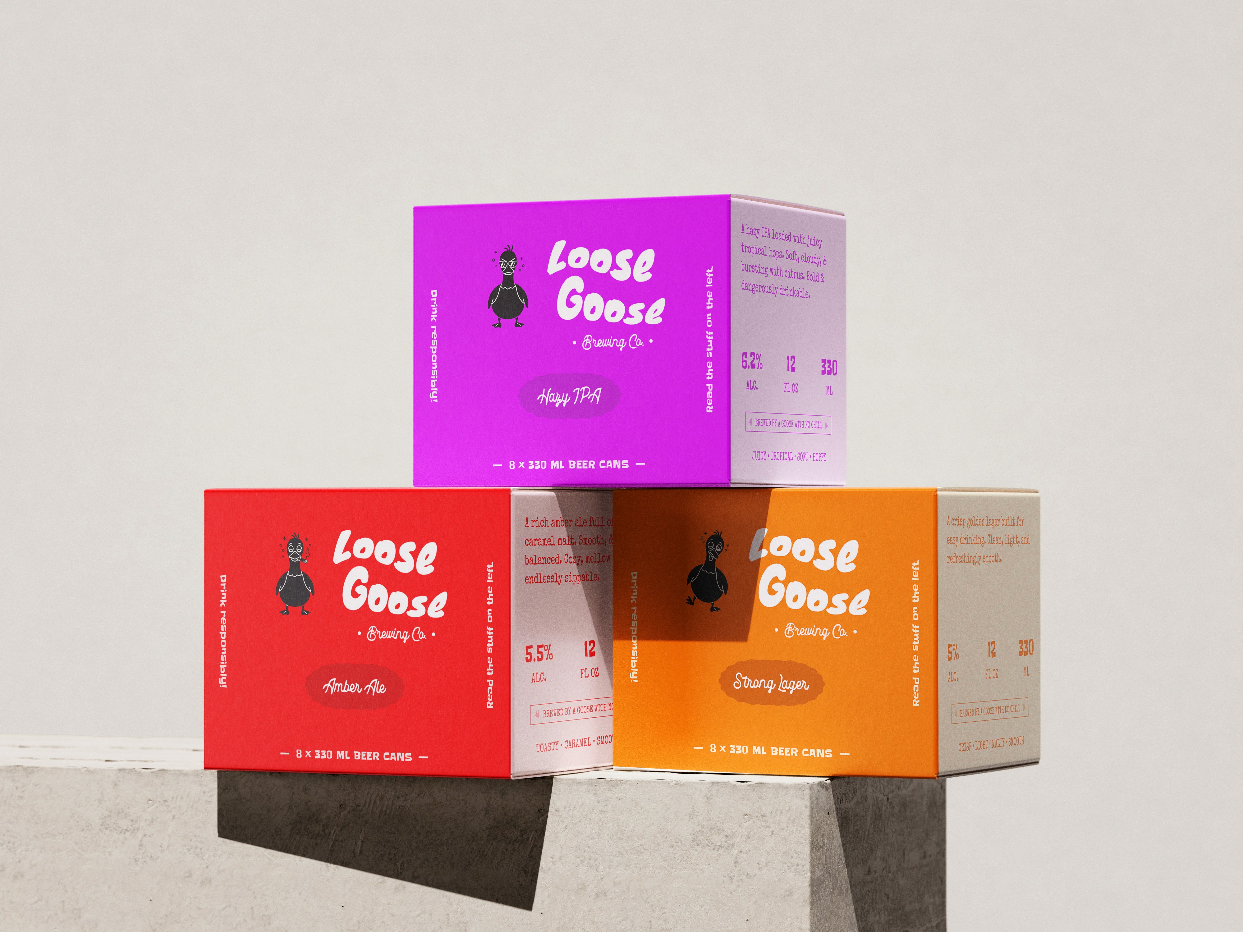
The Execution: The identity scales up into a modular, color-coded multi-pack boxing system.
The Detail: Each box relies on a single dominant palette shift, turning utilitarian corrugated cardboard into a premium graphic element. When stacked together, the boxes form an interlocking grid that reinforces the brand's spatial focus.
Taproom Touchpoints
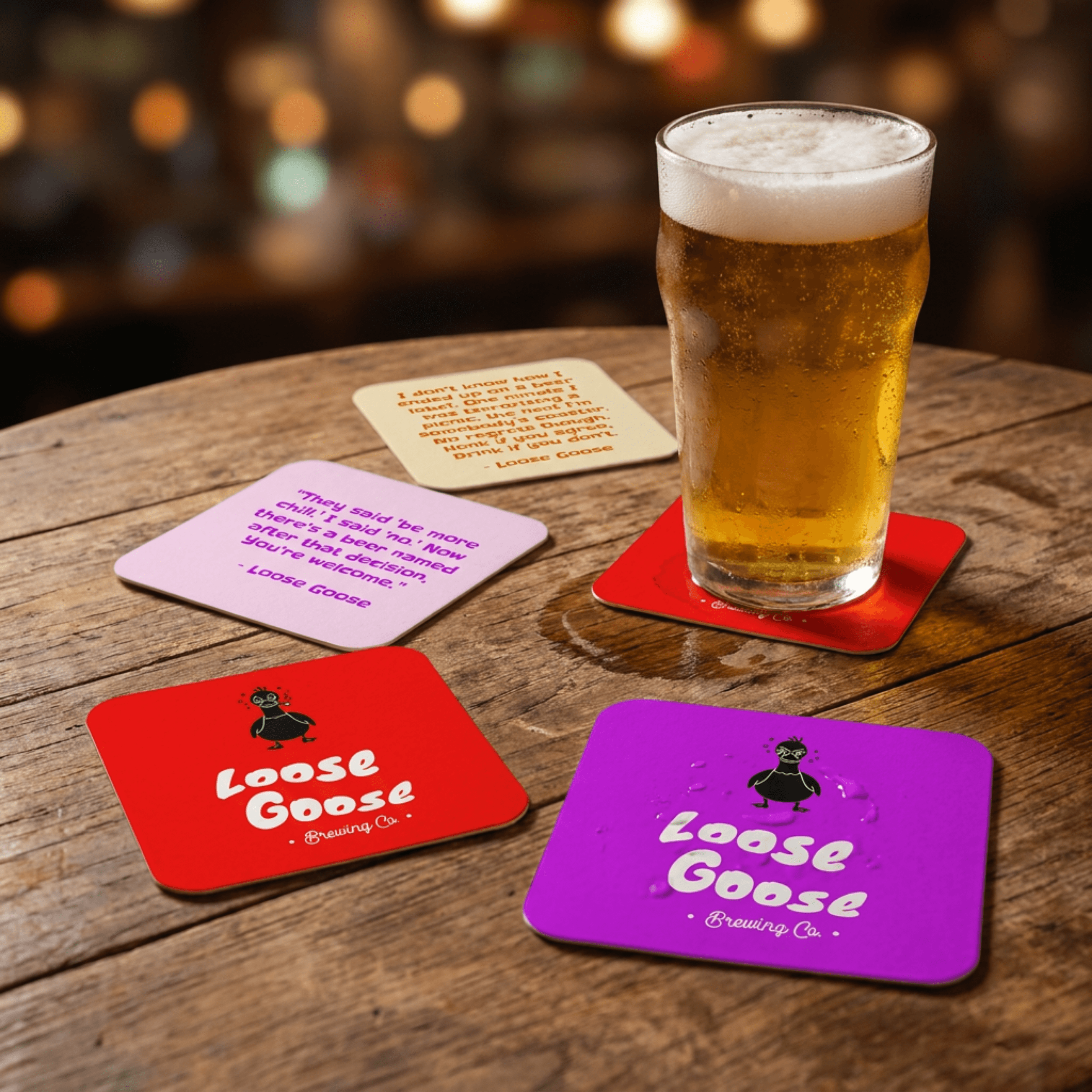
The Execution: The identity scales up into a modular, color-coded multi-pack boxing system.
The Detail: Each box relies on a single dominant palette shift, turning utilitarian corrugated cardboard into a premium graphic element. When stacked together, the boxes form an interlocking grid that reinforces the brand's spatial focus.

The Human Layer
The Execution: The apparel system avoids the promotional look of typical corporate merch.
The Detail: By treating the taproom staff and local community as part of the visual landscape, the heavy cotton shirt features a stark, centralized logo treatment that functions as a subtle badge of neighborhood membership.

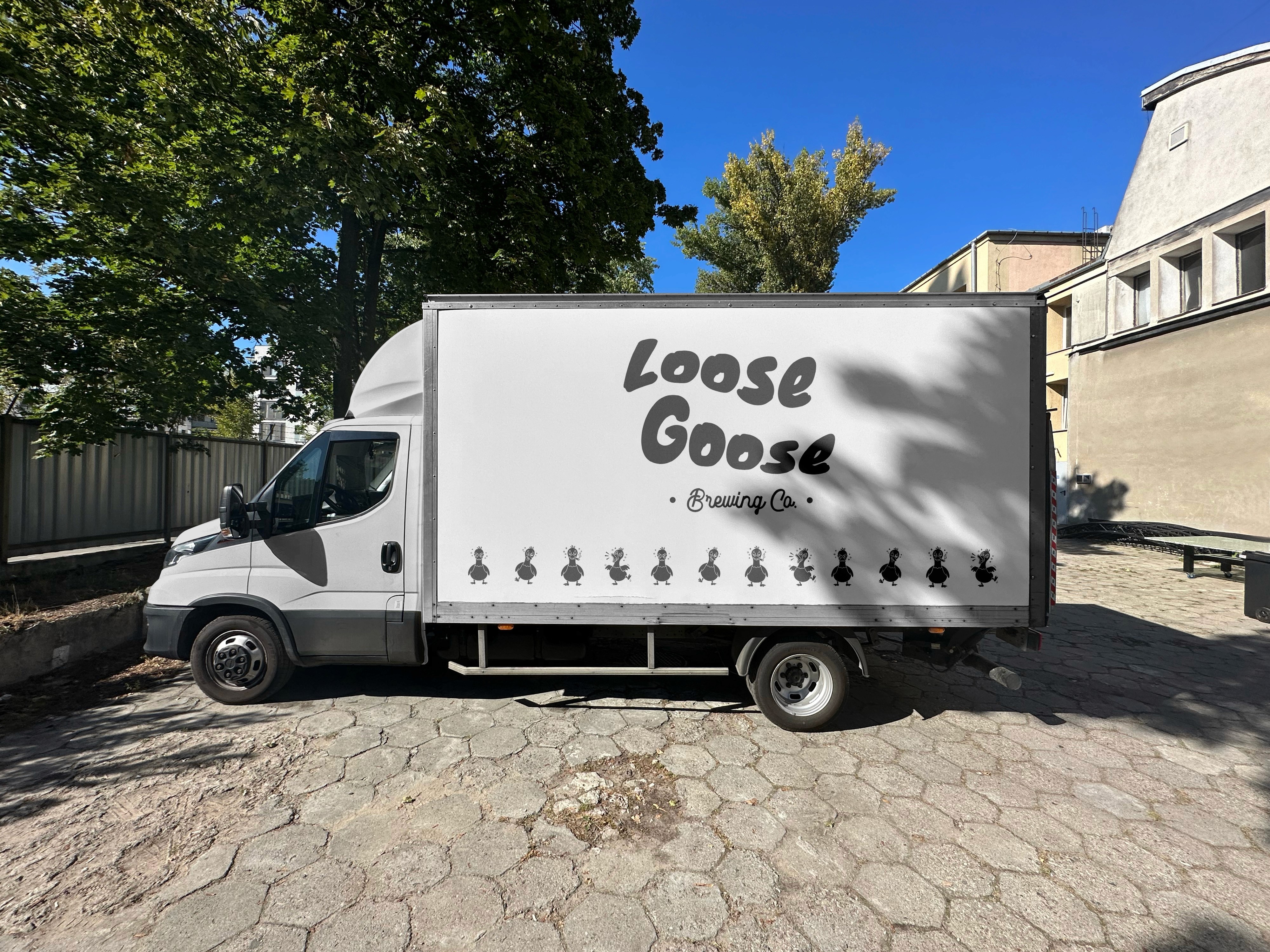
The Moving Billboard
The Execution: The final extension of the identity scales up to the city level through the delivery fleet.
The Detail: The trucks use massive, oversized typography treatments wrapped cleanly across functional panels. Stripping away cluttered marketing copy allows the fleet to act as a striking, moving architectural landmark.
The Outcome
Strategic Shift: Moving the narrative away from literal brewery cliches allowed the brand to immediately cut through market noise and claim a distinct cultural position.
Visual Friction: The pairing of rigid architectural grids with fluid, spontaneous elements successfully delivered a playful identity that remains sophisticated and mature.
System Impact: A highly cohesive, scalable ecosystem that transforms Loose Goose from a standard product line into a vital piece of local community infrastructure.