Monte Isola Branding
Event identity for IPRally's company offsite — stickers, slides, and a car-free Italian island.
Project Type
Branding, Event Design
Domain
Internal Culture @ IPRally
Product
www.iprally.com


Overview

What?
End-to-end event identity for IPRally's annual company offsite
Who?
~50 team members — "the Patent bunch"
Scope?
Badge, sticker, slide template, banner, icon set, pattern, typography
Constraint?
Must extend IPRally's existing brand — not override it
The Brief
Monte Isola has no roads. You reach it by ferry. The brief was to bottle that feeling — not design a corporate retreat kit, but create something that made people feel like they were going somewhere worth going.
The hard part: IPRally's brand is built for a B2B product. Finding warmth inside electric blue and geometric type was the whole design problem.
Final Slide Deck Version
Explorations
Direction 1 — Bold colours and Typo
Energetic, but nothing to do with IPRally. Wrong answer.
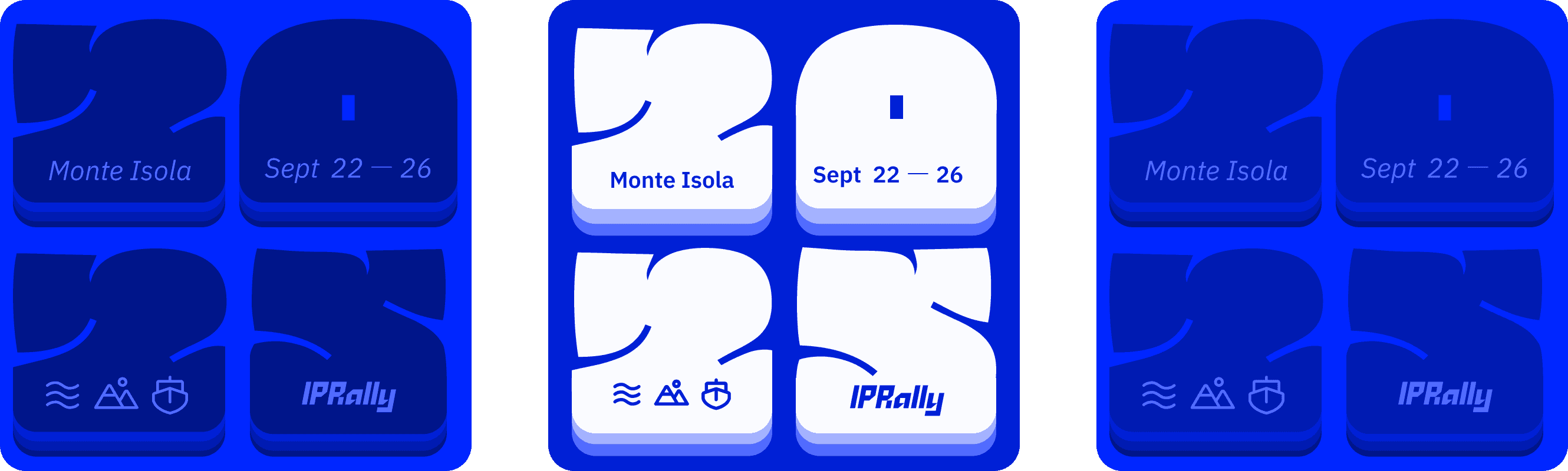
Direction 2 — Monochromatic bento
Same blue. Different depths. This held.
Final Designs
Design Philosophy
Here is the existing IPRally's brand typeface which is sharp, geometric, forward-leaning — built for a B2B patent tech product. It's serious. It works hard..

But the idea was to do something different for the Monte Isola branding… Let's begin with the sticker design…
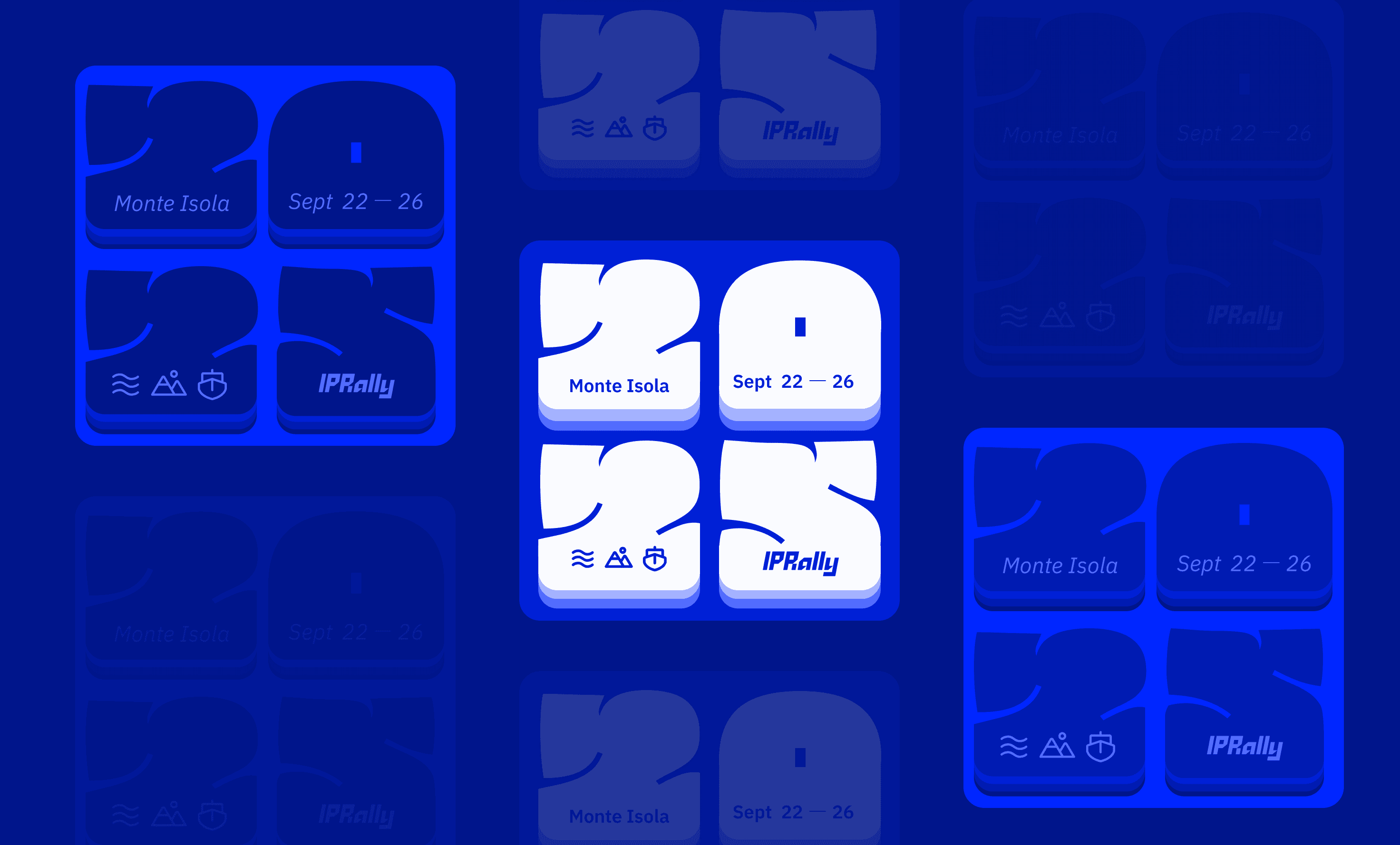
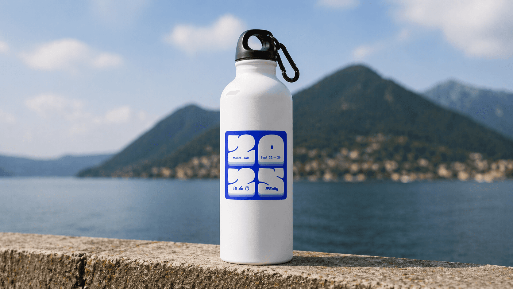
Sticker Design
The inflated "Ciao" & "2025" type is the release valve. It references Italian graphic design of the 70s — warm, round, unhurried.
It's saying you're off the clock, you're in Italy, breathe.
The contrast between the two typefaces is doing cultural work. One voice says IPRally. The other says Monte Isola.
Three variations were made so that everyone gets some different version.
The "2025" numeral works as the container. Each quadrant holds a piece of the story — location, date, icons, brand. Pull any one element and the rest still reads.
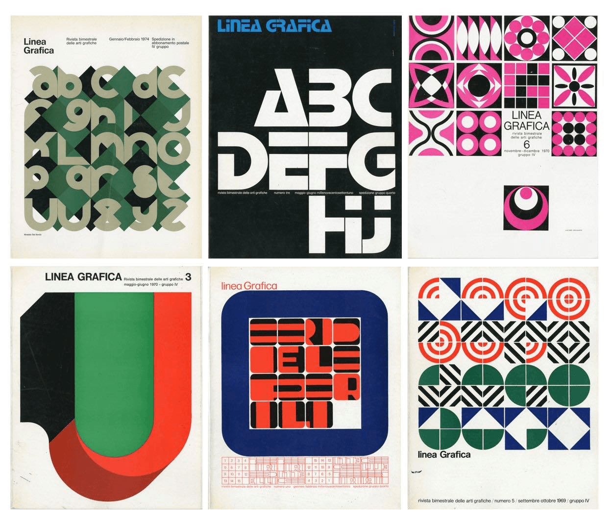
Italian graphic design reference from the 70s. Source: Google
Sticker on Water bottle
Slide Template Mockup
Every presentation that week opened on this. Built as an animated GIF — the icon ticker scrolls, the Ciao panel breathes.
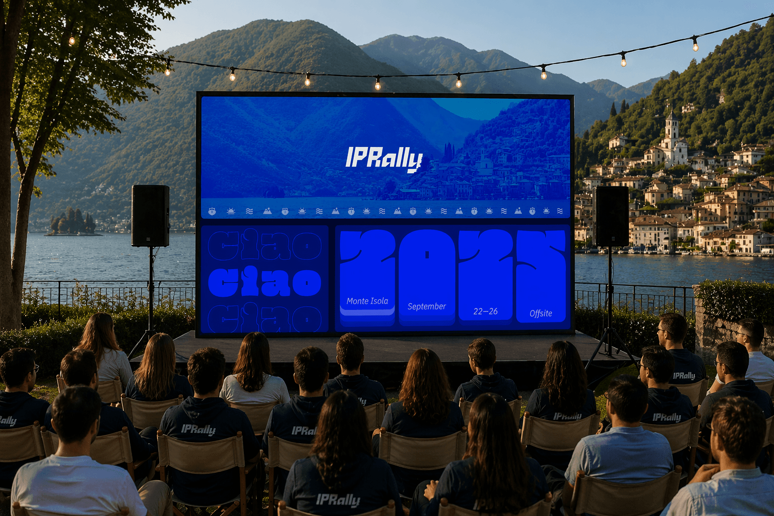
Bento grid logic: photo banner top, icon pattern top-right, Ciao panel bottom-left, date strip bottom-right. One template.
Zero boring openers.
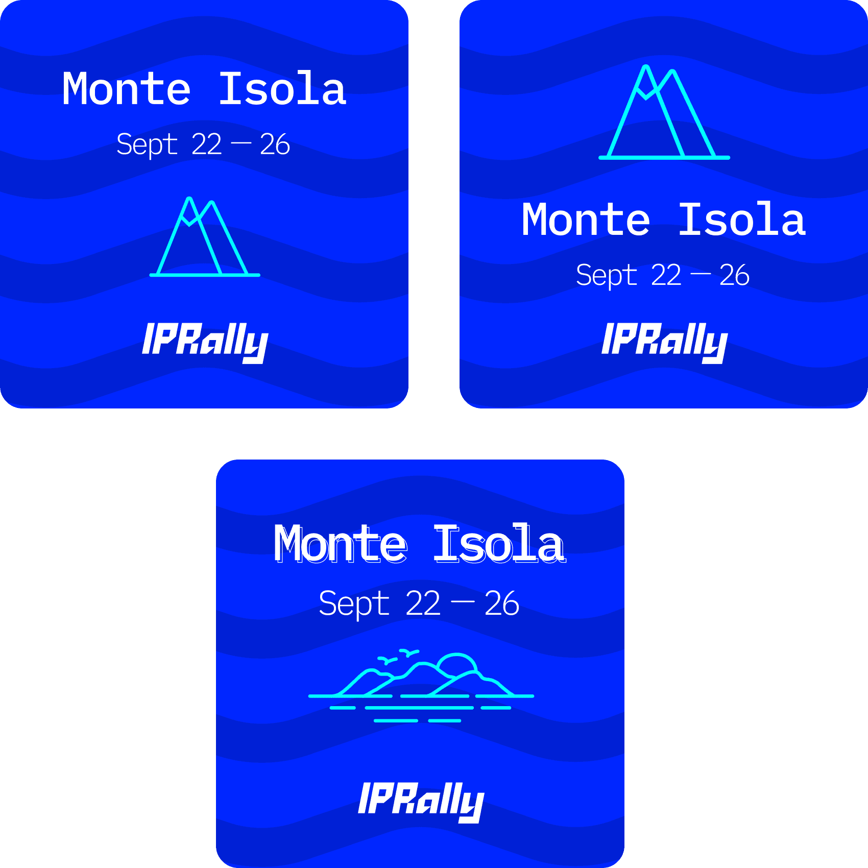
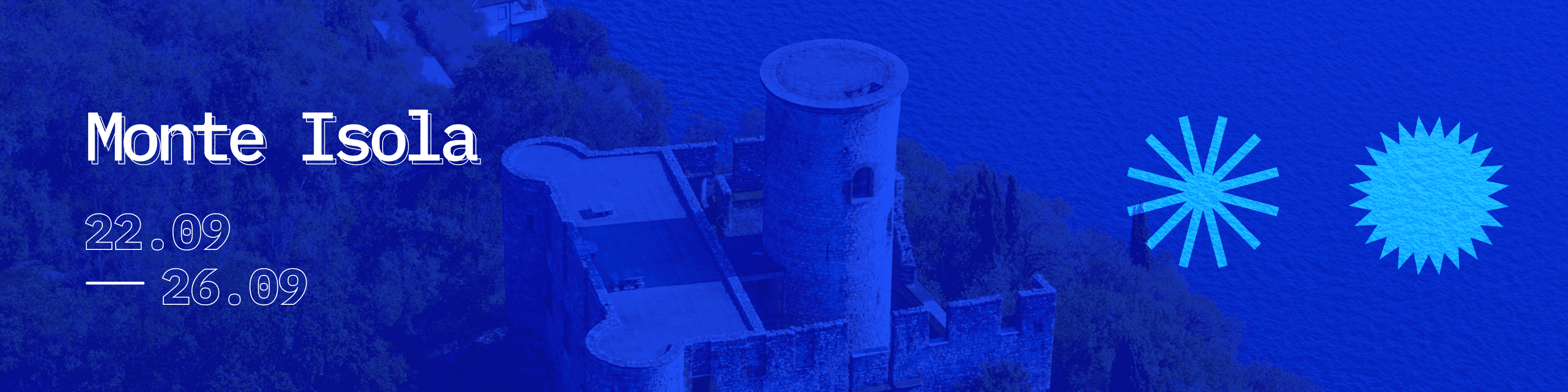
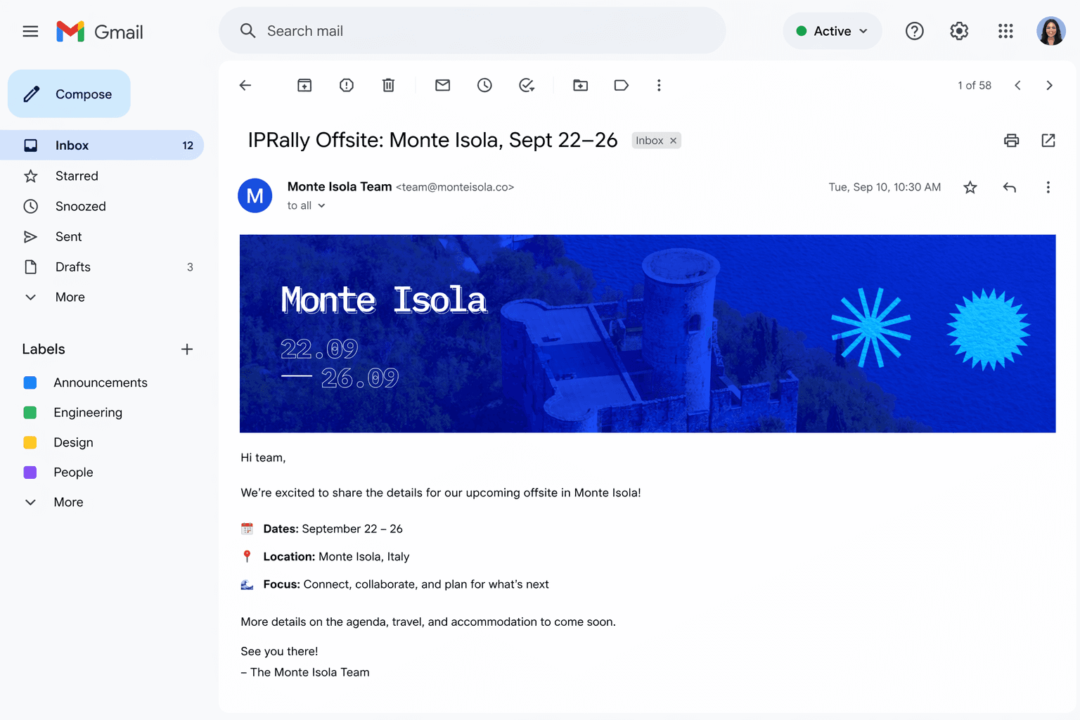
Digital Banner
Used as Slack channel headers, calendar event covers, and email banners in the week leading up to the trip.
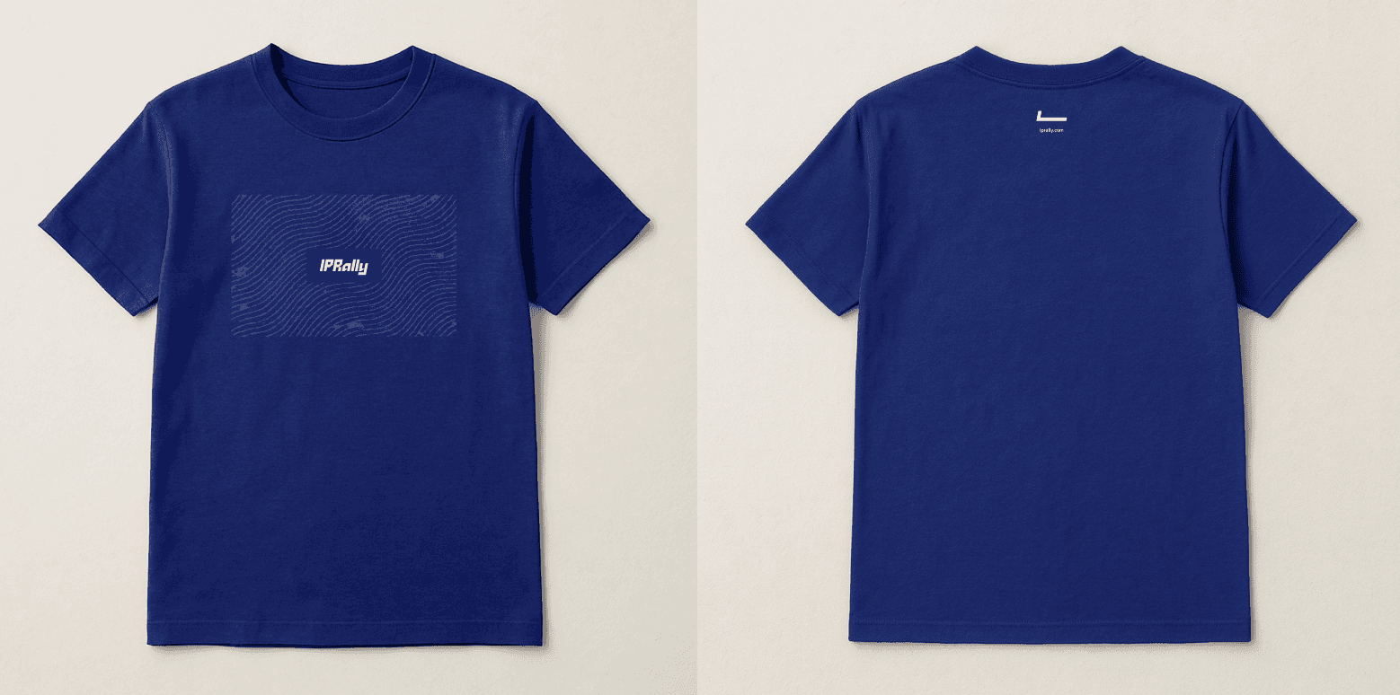
Tshirts
Outcome
Three sticker variants printed and shipped to all attendees.
The animated slide template used across every presentation during the offsite week.
The Slack banner went live two weeks before departure.